Attribute-based Styling
You can style layers based on data attributes to easily identify differences and trends. Each visualization aspect (Fill Color, Stroke Color, Stroke Width, Custom Marker, and Point Settings) can be styled by any field in your layer's data.
How to apply attribute-based styling
Layers panel, click your layer. Its settings panel opens on the right with the tabs Style, Filter and Metadata, and the Style tab selected. The styling options are in the Style section of this tab.- Fill Color
- Stroke Color
- Custom Marker
- Stroke Width
- Point Settings
Fill Color, click the options icon  and the
 Advanced Options will appear.Color based on, select the text or number field to style by.Palette, and choose a color palette or keep the default. Learn more in the Color Palette section below.Color scale and choose your data classification method. See all methods in the Data Classification section.Color scale panel, toggle No data to assign a color to features where the selected field has no value. The default color is grey (#CCCCCC). Click the color swatch to change it.Stroke Color (labelled Color for line layers), click the options icon and the Advanced Options will appear.Color based on, select the text or number field to style by.Palette, and choose a color palette or keep the default. Learn more in the Color Palette section below.Color scale and choose your data classification method. See all methods in the Data Classification section.Color scale panel, toggle No data to assign a color to features where the selected field has no value. The default color is grey (#CCCCCC). Click the color swatch to change it.Custom Marker, enable the toggle and click the options icon . The Advanced Options will appear.Marker based on, select the text field to style by.Ordinal Markers and choose the marker for each category value: pick from the Library or upload your own under Custom.Marker Settings, adjust the Size slider to set the base marker size, and use Placement to control where the icon is anchored relative to the map point (Center, Top, Bottom, Left, Right or a corner position such as Top Left).Allow overlap to prevent markers from being hidden when they overlap on the map. next to Marker Settings to show its Advanced Options and set Marker size based on to a numeric field to vary the marker size per feature. See the Point Settings tab for details on size classification.Stroke Width, click the options icon and the Advanced Options will appear.Stroke based on, select the numeric field to drive the stroke width.Size scale to open the classification panel. Choose a classification method and set the number of Steps (2–10). Each step shows a width preview alongside the value range.Stroke Width attribute-based styling applies to lines, polygons, and points.
Point Settings, click the options icon and the Advanced Options will appear.Radius based on, select the numeric field to drive the point radius.Size scale to open the classification panel. Choose a classification method and set the number of Steps (2–10). Each step shows a size preview alongside the value range. The same methods as color classification are available: QuantileGlossaryQuantile classificationA way to group data into classes for a map so that each class holds the same number of features, whatever the range of values inside it.Read more ↗, Standard DeviationGlossaryStandard deviation classificationA way to group data into classes for a map by how far each value lies above or below the average, measured in standard deviations.Read more ↗, Equal IntervalGlossaryEqual interval classificationA way to group data into classes for a map by splitting the range of values into steps of the same size, whatever the number of features in each.Read more ↗, Heads and Tails, Custom Breaks, and Custom Ordinal.Point Settings is only available for point layers without a Custom Marker. For point layers with a Custom Marker, use Marker size based on inside the Custom Marker tab.
Color Palette
A palette is a set of colors representing your data values or categories.
You can customize your palette by selecting the Type, adjusting Steps, enabling Reversed to reverse the colors, or enabling Custom for your own color range.
GOAT offers four predefined palette types:
| Palette Type | Example | Description |
|---|---|---|
| Diverging |  | Useful for data with a central midpoint, like positive and negative values. It helps show variations clearly around this midpoint. |
| Sequential |  | Ideal for data that follows a natural progression or ordered sequence, like increasing or decreasing values. It excels at visualising continuous data, showing gradual changes from one extreme to another. |
| Qualitative | | Designed for distinct categories or classes. It helps distinguish between discrete categories without implying any order or importance. |
| Singlehue |  | Uses different shades and tones of a single color. It creates a harmonious look and is effective for conveying information without the distraction of multiple colors. |
Data Classification Methods
The Color scale determines how data values map to colors. GOAT offers six data classification methods: Quantile, Standard Deviation, Equal Interval, Heads and Tails, Custom Breaks, and Custom Ordinal. For text fields, only Custom Ordinal is available. All the methods default to 7 classes, but you can adjust this number as needed.
Quantile
Divides data into classes with equal numbers of features. Ideal for linearly distributed data, but creates uneven value ranges.
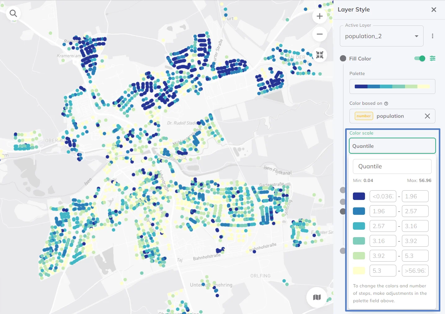
Standard Deviation
Classifies data by deviation from the average. Shows relative dispersion, distribution, and outliers statistically, but requires normally distributed data.
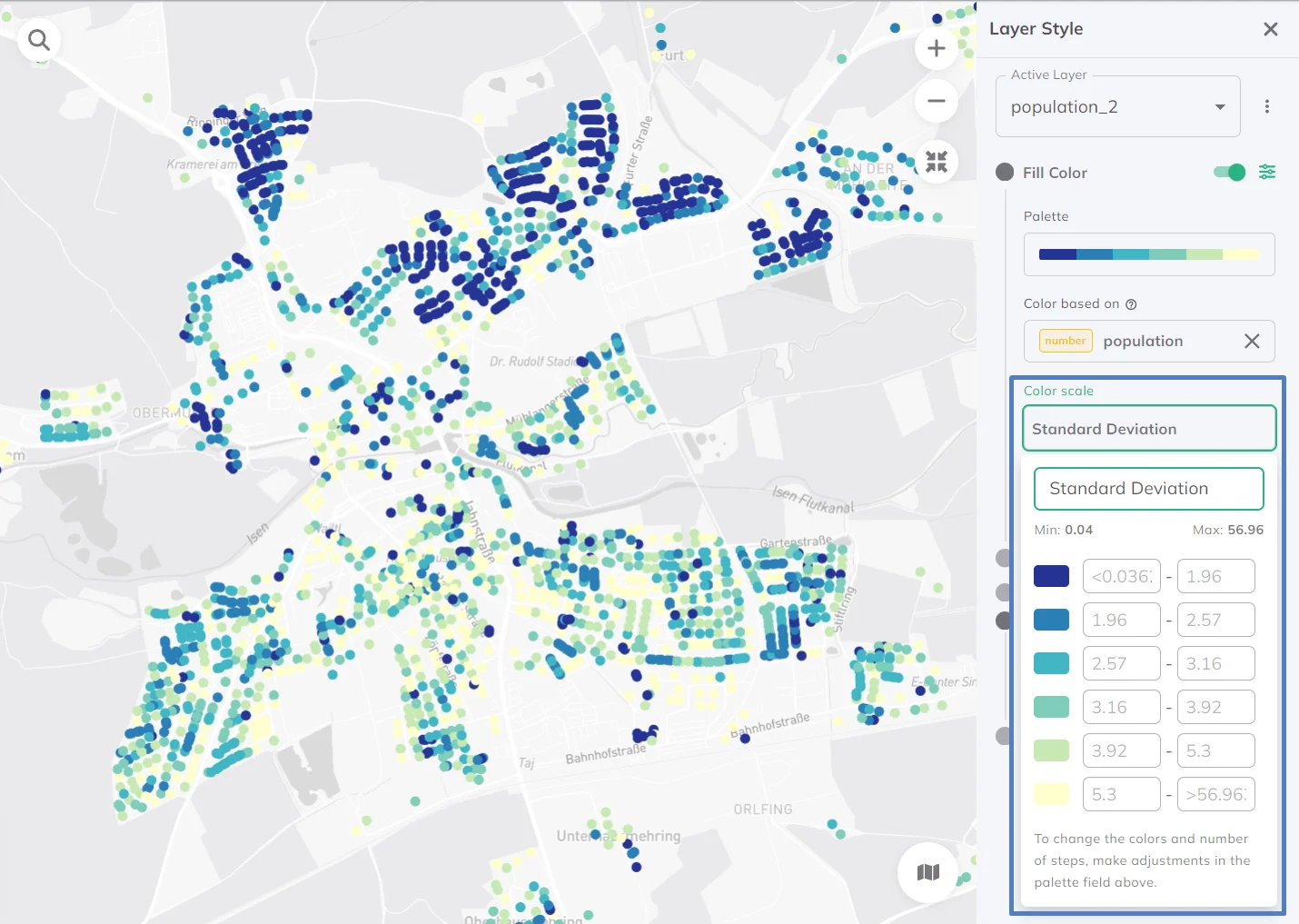
Equal Interval
Divides data into equal-sized value ranges. Works well for evenly distributed data but can be misleading with skewed data (some classes may be empty).
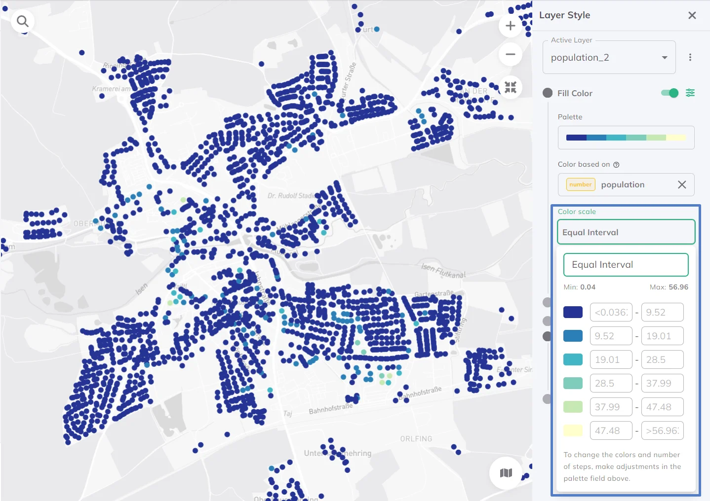
Heads and Tails
Handles skewed data by highlighting extremes. Focuses on 'heads' (very high values) and 'tails' (very low values). Useful for datasets where extremes matter most and for highlighting disparities.
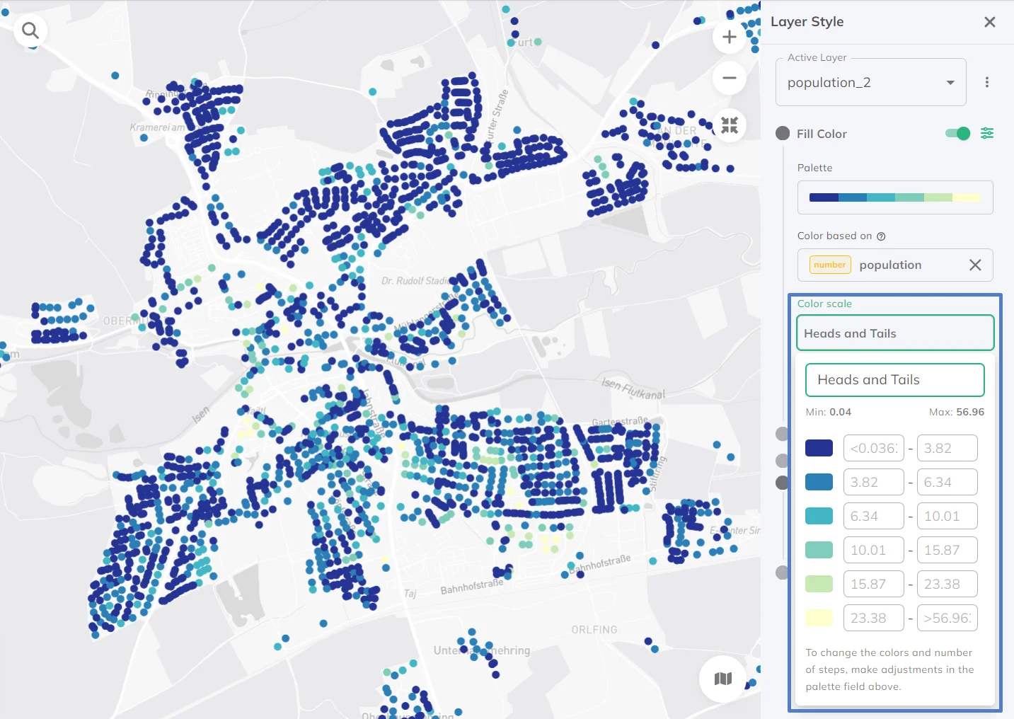
Custom Ordinal (for strings)
Sorts and visualizes string data like categories or labels. Since strings lack natural order, Custom Ordinal lets you define your own ordering rules for tailored sequences.
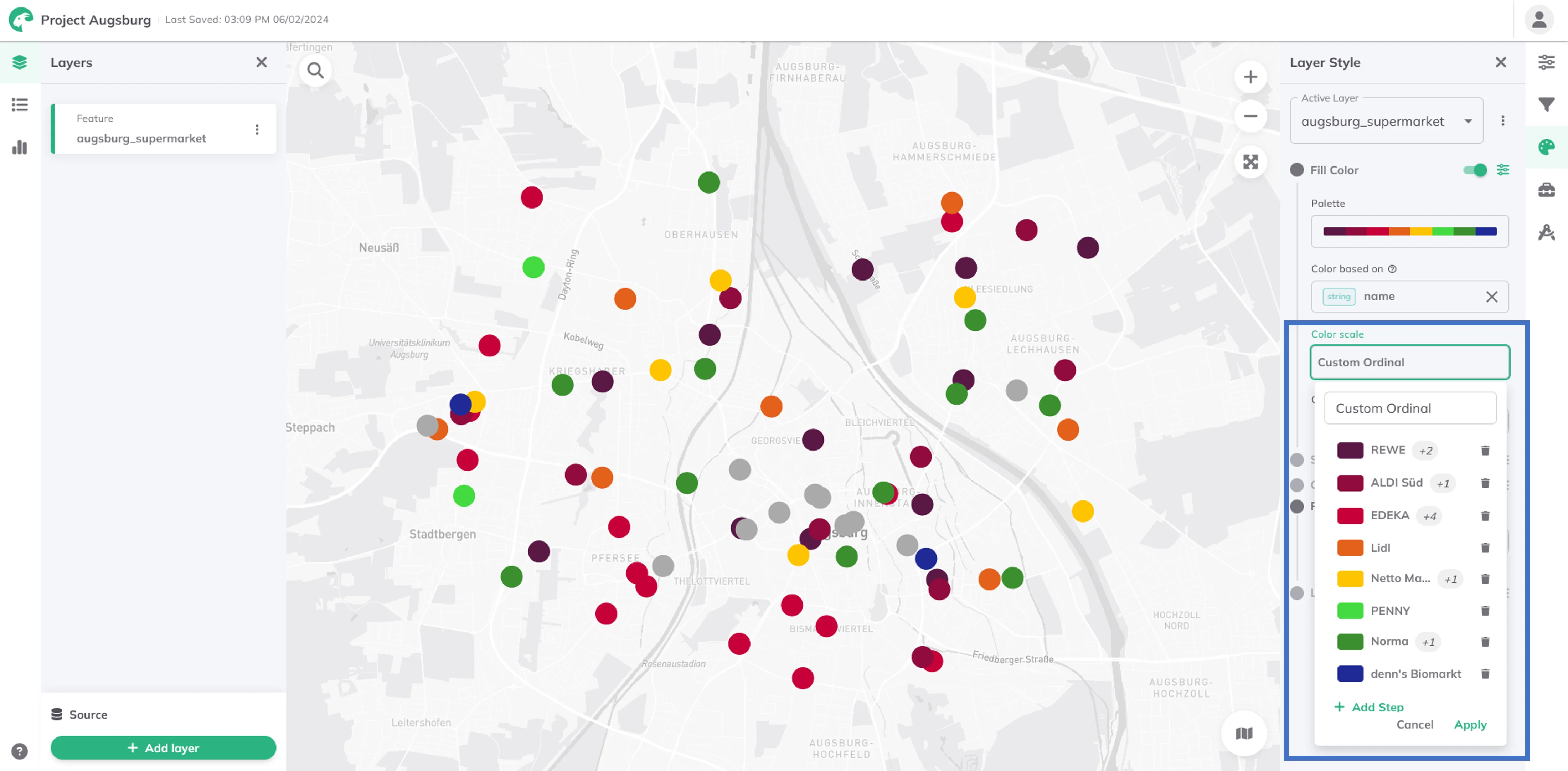
You can add more steps and select multiple string values per group from the dropdown menu, which lists all values from your dataset.
Custom Breaks (for numbers)
For numerical data with custom breakpoints or thresholds. It provides tailored visualizations for specific contexts. Helps maintain consistency across maps. Gives full control over classifications aligned with real-world needs.
To reuse your dataset with the styling settings in other projects, save your style as default.