Popup
Popups display relevant information when users interact with map features. This keeps your map clean while providing detailed information on demand. You can choose when to show the popup, add content blocks, and control how everything is presented.
How to configure popups
1
In the
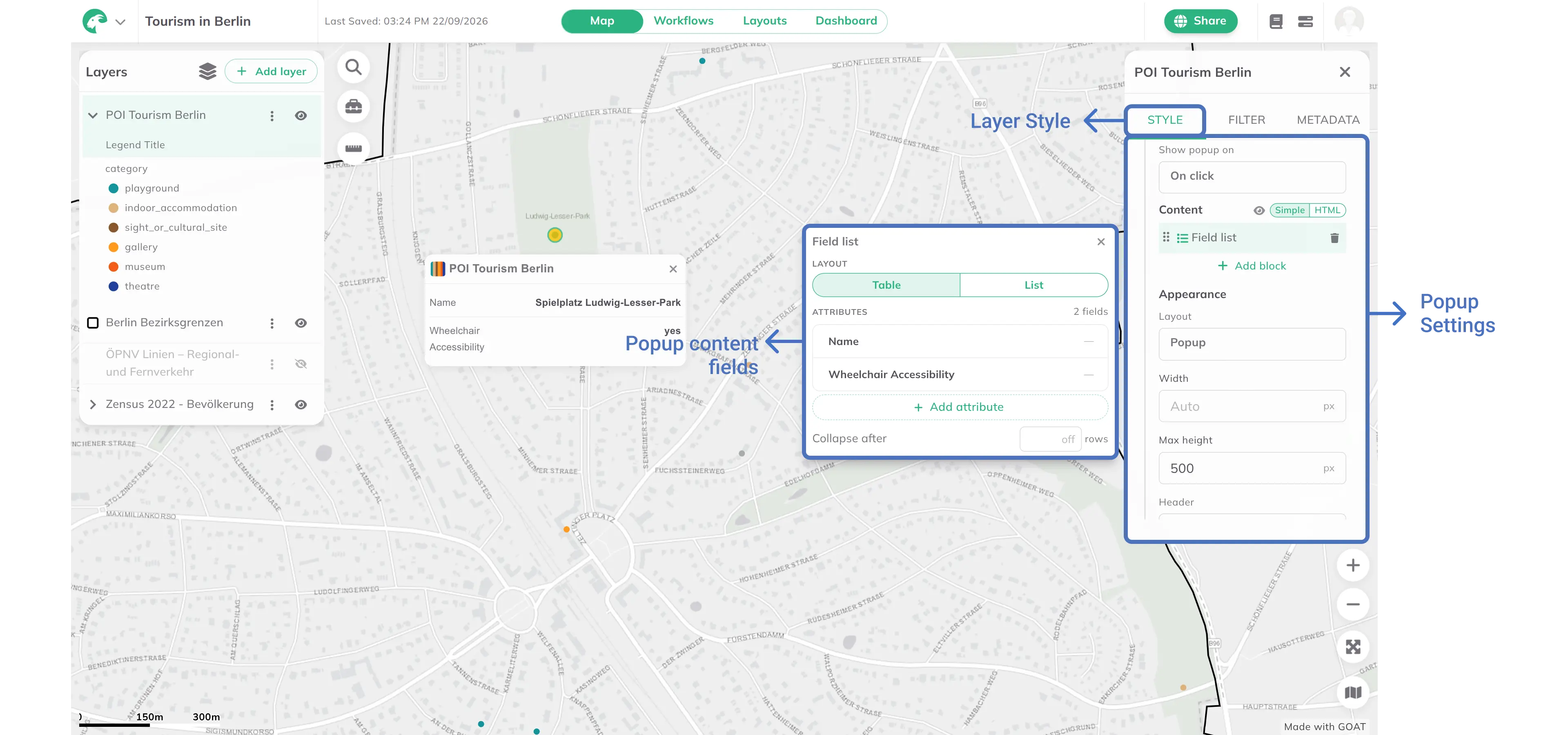
Layers panel, click your layer. Its settings panel opens on the right with the tabs Style, Filter and Metadata, and the Style tab selected. Open the Popup section of this tab and enable the Popup toggle.2
Set
Show popup on: On click, Only on hover, or On click and on hover.3
Under
Content, keep Simple selected and click + Add block to add content blocks. Available block types: Text, Field list, Image, Button, Badge, Divider. Click a block in the list to edit it, drag it to reorder, or click the trash icon to remove it. The eye icon (Show preview) shows a preview popup on the map.4
For a
Field list block: choose Table or List as Layout, click + Add attribute to select which fields to display (or Add all fields), and optionally set Collapse after to limit the number of visible rows.5
Under Appearance, configure the following options:
Layout: choosePopuporPinned; forPinned, choose the corner underAnchorWidth: set a fixed width in px, or leave asAutoMax height: set a maximum height in px to enable scrolling for long contentHeader: chooseStandard,Compact, orNoneHighlight active feature: toggle to highlight the selected feature on the map
HTML mode
For full control over the popup design, switch from Simple to HTML mode under Content. This lets you write custom HTML and CSS to create rich, branded popups, with images, styled cards, custom fonts, and dynamic field values.
1
Under
Content, click HTML in the Simple / HTML toggle. The first time, GOAT converts your existing blocks into HTML.2
On the
Custom HTML card, click Edit… to open the Custom HTML editor and write your custom markup. The editor shows a live preview next to your code and the Appearance options on the right. Click Save to apply your changes.3
Use
{{field_name}} placeholders to inject feature attribute values dynamically into your HTML. Type {{ to get field suggestions, or pick a field under Insert Field.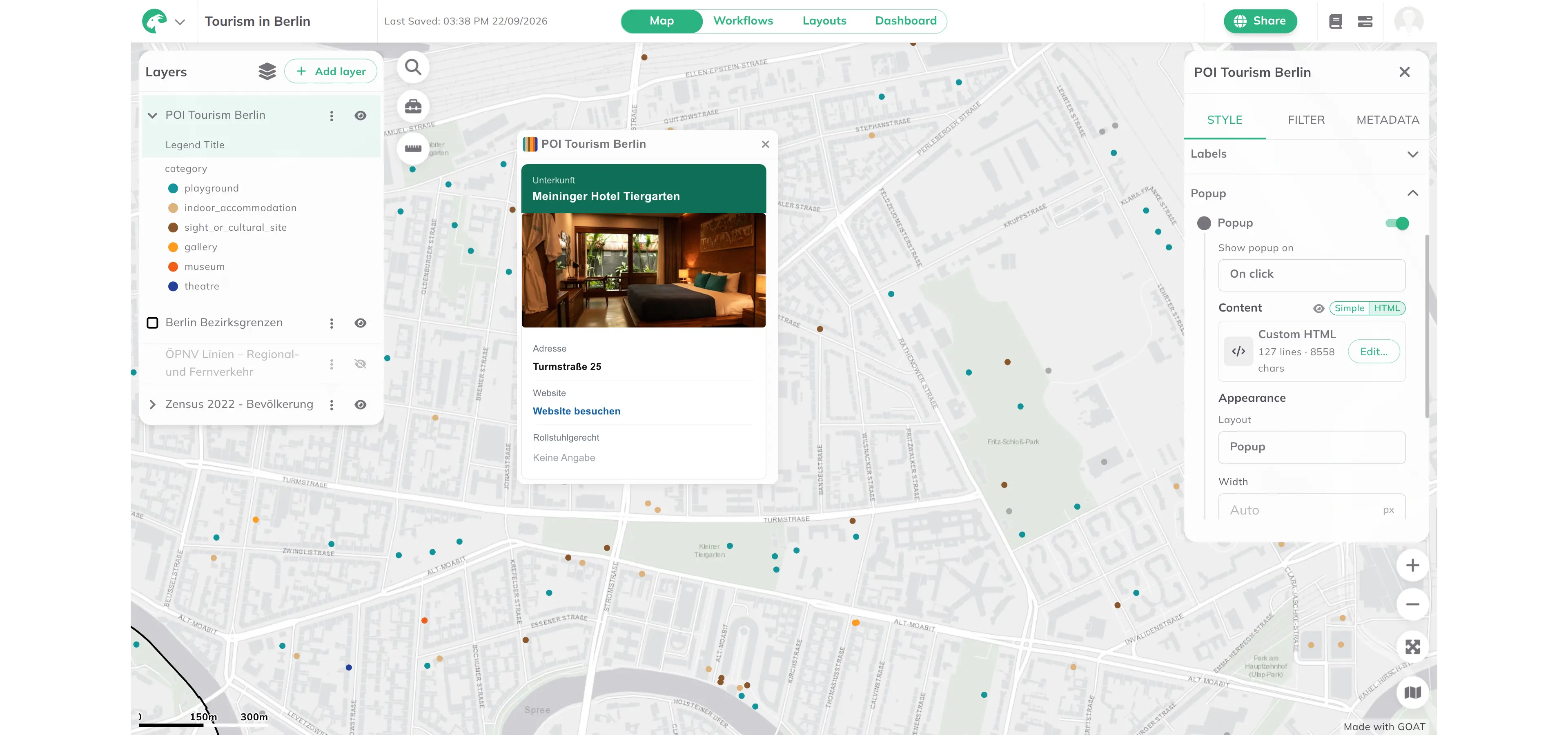
Best practices
- Choose relevant fields that provide meaningful context to users
- Use clear, descriptive names instead of technical field names
- Limit the number of fields to avoid overwhelming users with information
- Use collapse to keep popups compact when showing many attributes