Heatmap - Closest Average
The Heatmap - Closest Average indicator produces a color-coded map visualizing the average travel cost (time or distance) to points (such as amenities) or polygons (such as parks) from surrounding areas.
1. Explanation
The heatmapGlossaryHeatmapA map that shows a computed value across a continuous surface using colour, rather than symbols at individual locations.Read more ↗ displays a color-coded hexagonal grid showing average travel costs to destinations (opportunities) using real-world transport networks. You can specify the routing type, cost type (time or distance), opportunity layer, number of destinations and travel cost limit to produce the visualization.
-
The opportunity layer contains point or polygon based destinations (POIsGlossaryPoint of Interest (POI)A specific location that matters in an analysis. In accessibility work, usually a place of everyday need: a supermarket, a school, a doctor, a pharmacy.Read more ↗, transit stations, schools, amenities, parks, or custom data) that you want to analyze accessibility to. You can use multiple opportunity layers and they will be combined to produce a unified heatmap.
-
Setting
Number of destinationslimits the calculation of average travel costs to upto the n nearest opportunities. This allows you to produce a more targeted accessibility analysis.
Key difference: Heatmaps show access from many origins to specific destinations, while catchment areasGlossaryCatchment areaThe area that can be reached from a point within a given travel time or distance, following the real network rather than a straight line.Read more ↗ show reach from specific origins to many destinations.
Heatmap computation is available across over 30 European countries for Walk, Bicycle, Pedelec, and Car. For Public Transport, Germany, Switzerland, and the Haut-Rhin region of France are supported. If you need analyses beyond these regions, you can import your own routing network or contact us and we will do it for you.
2. Example use cases
-
Do residents in certain areas have longer average travel timesGlossaryTravel timeHow long a journey between two places actually takes by a given mode, measured along the network rather than as straight line distance.Read more ↗ to amenities than others?
-
How does the average travel time to amenities vary across different modes of transport?
-
How does the average travel time vary across different types of amenities?
-
If standards require that a minimum number of amenities be accessible within a certain travel time, which areas meet these standards?
3. How to use the indicator?
Toolbox  .
.Accessibility Indicators menu, click on Heatmap Closest Average.Routing & Configuration
Transport mode you would like to use for the heatmap.| Mode | Considers |
|---|---|
| Walk | All paths accessible by foot |
| Bicycle | All paths accessible by bicycle (taking into account surface and slope) |
| Pedelec | All paths accessible by pedelec (taking into account surface and slope) |
| Car | All paths accessible by car (taking into account speed limits and one-way restrictions) |
| Public Transport | All journeys possible by public transport (according to official GTFSGlossaryGTFSAn open standard for publishing public transport timetables, stops and routes as a set of text files, so any software can read the same data.Read more ↗ schedules), considering walking access and egress to and from stops |
Transport mode you picked in step 3:- Walk / Bicycle / Pedelec / Car
- Public Transport (PT)
In the Calculate by menu, choose either the Time (minutes) or Distance (metres) cost type.
Choose PT modes to analyze: Bus, Tram, Rail, Subway, Ferry, Cable Car, Gondola, and/or Funicular. Then, select the Day and Arrival time for the analysis. The best public transport journeys that reach the opportunities at or before this time will be considered.
Advanced options
Optionally, enable Advanced options to configure additional settings for routing and heatmap generation.
Reference area - a polygon layer that represents your study area. The heatmap then covers all H3 cells within that polygon. For Walk, Bicycle, Pedelec and Car, it also replaces the travel cost Limit: destinations outside the area also count if they lie within the distance reachable in the mode's maximum travel time (45 minutes, 90 for Car); the street network is loaded for the area and those destinations, and every cell gets its actual average travel cost, however far away the destinations are. A cell without a street of its own is reached via the nearest street, including the walk from the cell's centre; only cells more than 500 m from any street keep the value NULL. The diagonal of the area's bounding box may be at most 100 km (300 km for Car), the same maximum as in the Travel Cost Matrix. For Public Transport, the Limit still applies.Opportunities
Input layer from the drop-down menu. This can be any previously created layer containing point or polygon based data.Limit in minutes or metres for your heatmap. This will be used according to your previously selected transport mode and cost type. The field is not shown when a reference area replaces the limit (step 5).Need help choosing a suitable travel time limit for various common amenities? The "Standort-Werkzeug" of the City of Chemnitz can provide helpful guidance.
Number of destinations that should be considered while computing the average travel cost.+ Add Opportunity to include additional opportunity layers. Each layer can have different travel cost limits and destination counts for multi-criteria analysis.Result Layer
Result layer name for the output heatmap layer.Run to start the calculation of the heatmap.Results
Once the calculation is complete, a result layer will be added to the map. Clicking on any of the heatmap's hexagonal cells will reveal the computed average travel cost value for that cell.
4. Technical details
Cell costs
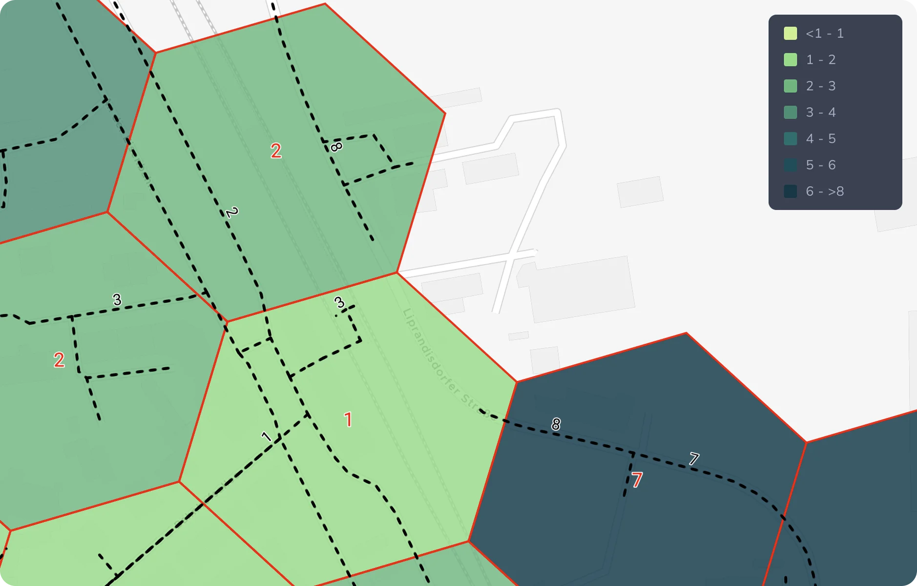
When multiple edges (streets) of the road network intersect a hexagonal cell, the cell's cost is calculated as the minimum of all edge costs within that cell. For the closest-average-based heatmap, this cost value (represented by tᵢⱼ) is then used according to the formula described in the following section to determine the average travel cost (time or distance) of each cell.
Calculation
After combining all opportunity layers (for example, schools, shops, or parks), the tool creates a grid made of hexagonal cells around the area. It only includes cells where at least one opportunity can be reached based on the selected routing type (e.g., walking, cycling) and travel cost limit (e.g., 15 minutes). With a reference area and a street-based routing type, there is no limit: the grid covers the reference area and the street network within its bounding box.
Then, for each cell, it calculates the average travel cost to the nearest n destinations (as set in the settings).
The formula for average travel cost (time or distance) is:
For each cell (i), the tool adds up the travel costs (tij) to all reachable opportunities (j), up to n of them, and divides by n to get the average travel cost.
Classification
In order to classify the accessibility levels that were computed for each grid cell, a classification based on quantilesGlossaryQuantile classificationA way to group data into classes for a map so that each class holds the same number of features, whatever the range of values inside it.Read more ↗ is used by default. However, various other classification methods may be used instead. Read more in the Data Classification Methods section of the Attribute-based Styling page.
Visualization
Heatmaps in GOAT utilize Uber's H3 grid-basedGlossaryH3 gridA system that divides the earth's surface into hexagonal cells at several resolutions, used to compute and display values over an area.Read more ↗ solution for efficient computation and easy-to-understand visualization. Behind the scenes, accessibility is computed on-the-fly by GOAT's own routing engine. For each routing type, the engine routes outward from the opportunities to discover the reachable H3 cells and their travel costs, then aggregates these into a per-cell accessibility score. Public transport uses the RAPTOR-based engine, while the active mobilityGlossaryActive mobilityGetting around under your own power, mainly walking and cycling, including pedelecs, wheelchairs and scooters.Read more ↗ and car modes use GOAT's Dijkstra implementation.
The resolution and dimensions of the hexagonal grid used depend on the selected routing type:
| Mode | Resolution | Average hexagon area | Average hexagon edge length |
|---|---|---|---|
| Walk | 10 | 11,285.6 m² | 65.9 m |
| Bicycle | 9 | 78,999.4 m² | 174.4 m |
| Pedelec | 9 | 78,999.4 m² | 174.4 m |
| Car | 8 | 552,995.7 m² | 461.4 m |
| Public Transport | 9 | 78,999.4 m² | 174.4 m |
For further insights into the Routing algorithm, visit Routing. In addition, you can check this Publication.
Example of calculation
The following examples illustrate the computation of a closest-average-based heatmap for the same opportunities, with a varying Number of destinations value.
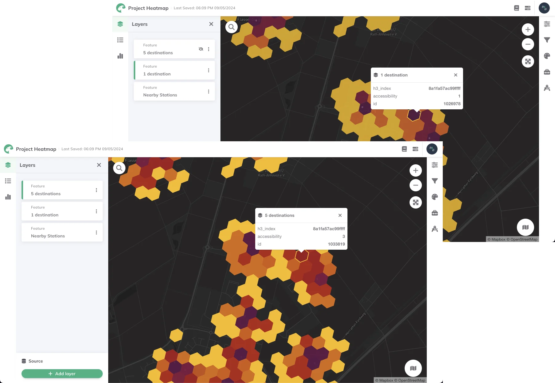
In the first example, the average travel time is computed considering only the closest destination, while in the second example, the closest 5 destinations are considered.