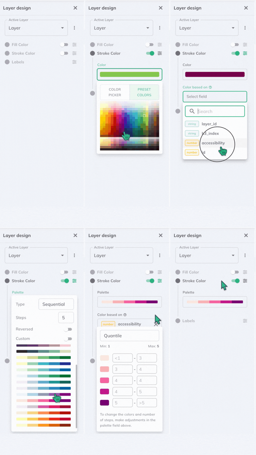
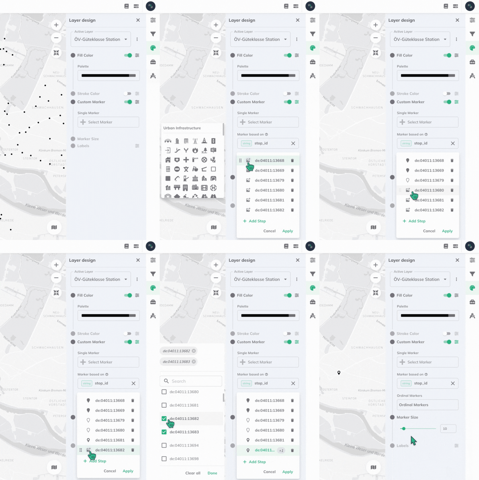
Attribute-based Styling
GOAT supports attribute-based styling to enhance the visualization of data on maps. This approach allows the visual representation to reflect variations and patterns in the data, making it easier to understand complex spatial information.
In the Layer design menu, you will find styling options for your selected layer. Each aspect of a layer's visualization (Fill Color, Stroke Color, Custom Marker and Labels) can be individually styled according to a field or attribute within the layer's data. To enable attribute-based styling for any of these, ensure its attribute toggle is ON, and then click the options button ![]()
If you would like to save your styling settings and use them in further projects, you can do so by saving a style as default.
Select Attribute
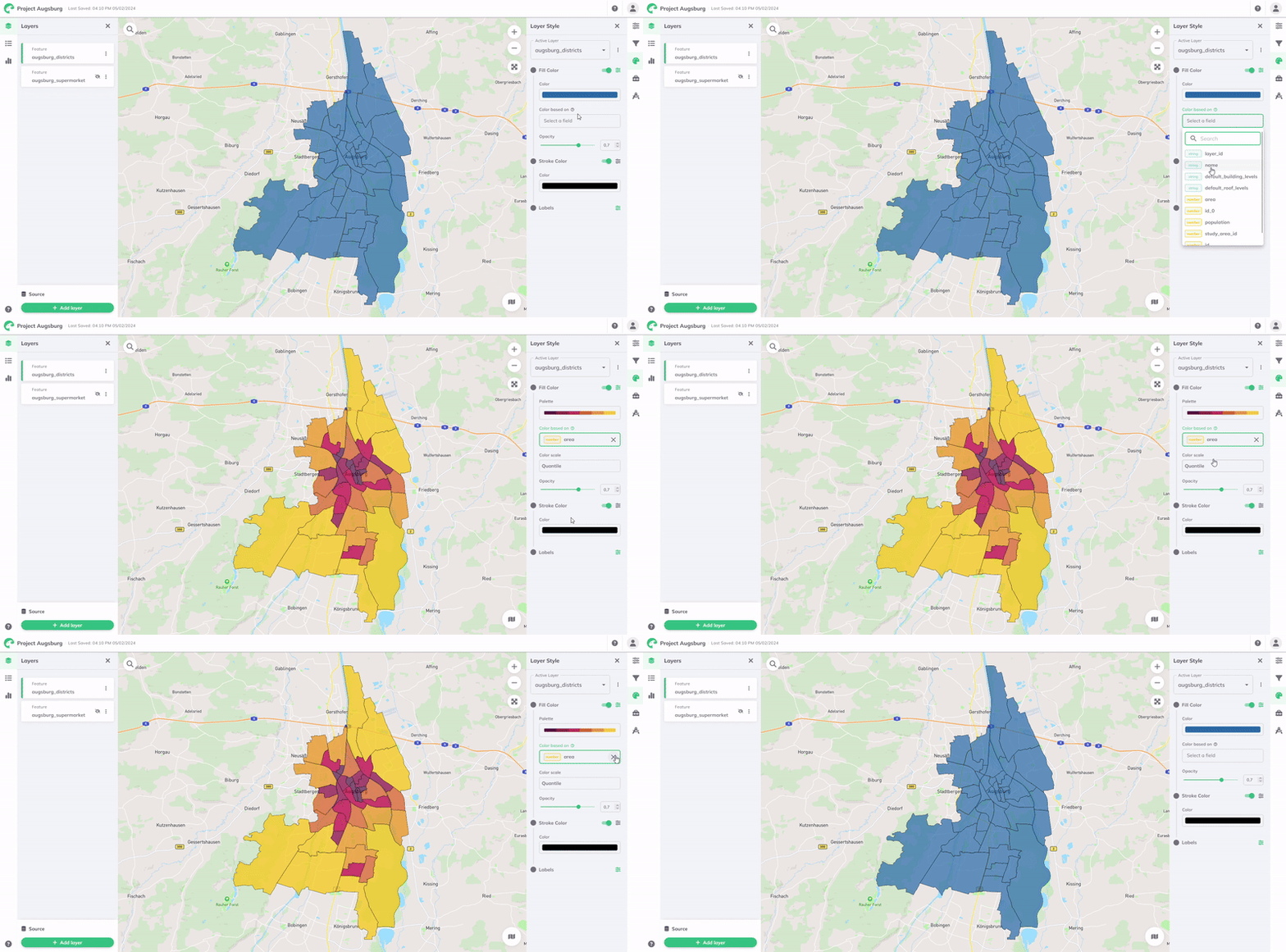
To style based on an attribute, select it from the Color based on field's dropdown menu. This will list all the attributes or columns available in your layer's data.
The visualization will then be styled automatically according to the range of values in the data. A Color Palette and Color Scale is assigned by default, but can all be customized to better suit your data and visualization needs. The color scale uses a data classification method to determine how data values are assigned to different color categories.
Color Palette
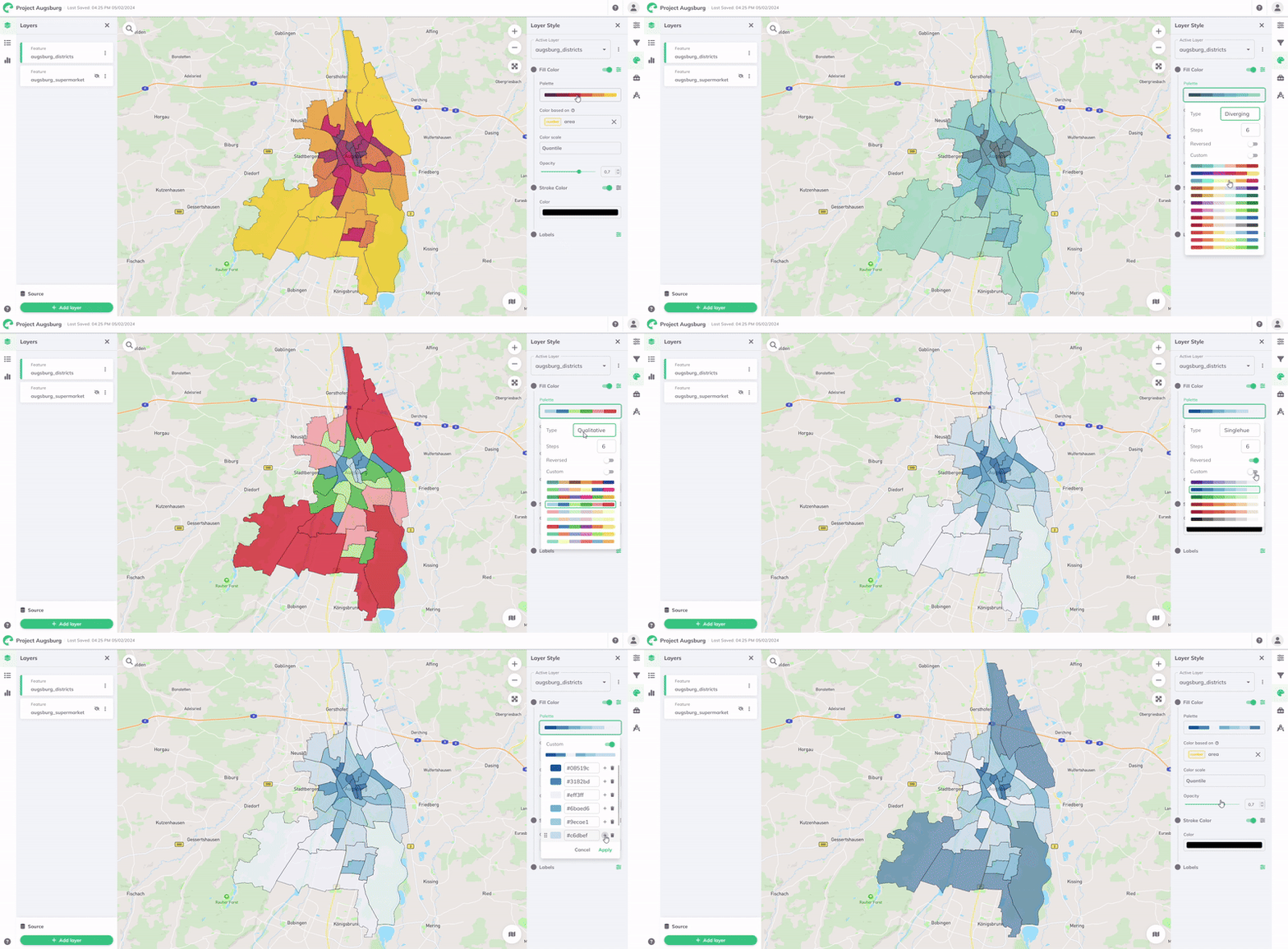
In this section, you will find GOAT's comprehensive set of palettes, all designed to provide visually impactful spatial data representation. A palette is a collection of colors chosen to represent the scale of values or categories within your layer's data.
For further customization, you may choose a different palette Type, number of Steps, or Reverse the colors. You can also define a custom range of colors by enabling the Custom toggle button.
GOAT provides a comprehensive set of predefined palettes, categorized into four different palette types for ease of selection and application.
| Palette Type | Example | Description |
|---|---|---|
| Diverging | This type of color palette is ideal for displaying data that is centred around a critical midpoint or has a natural division. It is particularly useful for displaying data characterised by both positive and negative variations from a central value, allowing these variations to be visualised clearly and effectively. | |
| Sequential | This color palette is designed for data that follows a natural progression or ordered sequence. It excels at visualising continuous data, where values either incrementally increase or decrease along a spectrum. This makes it particularly suitable for clearly displaying data that gradually changes from one extreme to the other. | |
| Qualitative | This color palette is designed for data that is categorised into specific, distinct groups or classes. Qualitative color palettes are designed to distinguish between discrete categories. Importantly, these palettes do so without suggesting any inherent order or relative importance between the different categories. | |
| Singlehue | This color palette is a type of color scheme used in data visualisation that uses different hues, shades and tones of a single color. This approach creates a visually coherent and harmonious aesthetic that can be particularly effective in conveying information without the distraction of multiple colors. |
Color Scale
Under the Color Scale, you will find the data classification method and the color scale that associates data values with a spectrum of colors. It converts a given data value within a given range (domain) into a corresponding color from a given color spectrum (range). GOAT provides six predefined data classification methods: Quantile, Standard Deviation, Equal Interval, Heads and Tails, Custom Breaks, and Custom Ordinal.
Data Classification Methods
Quantile
The Quantile classification divides data into groups with an equal number of values in each class based on their attribute values. This method is useful for analyzing and visualizing patterns in data and can help identify trends and patterns that may not be obvious easily. The fact that the data values are grouped in equal quantities within each class makes this approach ideal for data that is linearly distributed. Per default, the data is distributed into 7 classes.
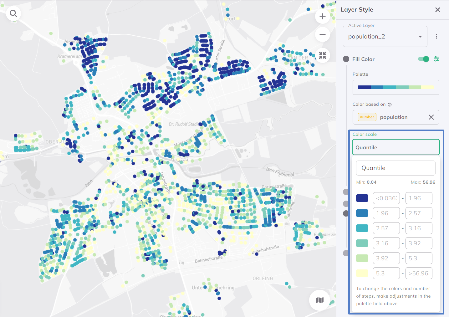
Want to deeper understand what quantile classification is? Check our Glossary.
Standard Deviation
The Standard Deviation method is a statistical approach used in data visualization. It uses the concept of standard deviation, a measure of the amount of variation or dispersion in a set of values, to determine how data points are assigned to different color categories. This method is valuable for its ability to provide a statistical perspective on the data, allowing users to quickly grasp the relative dispersion and distribution of values within the dataset. Per default, the data is distributed into 7 classes.
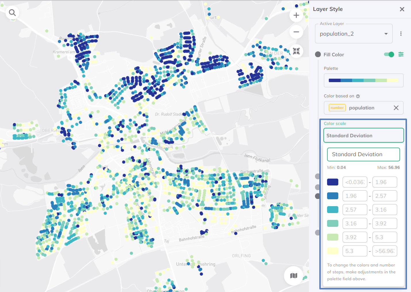
Equal Interval
For the Equal Interval classification, the range of the attribute values is divided into equal interval classes. Per default, the data is distributed into 7 classes.
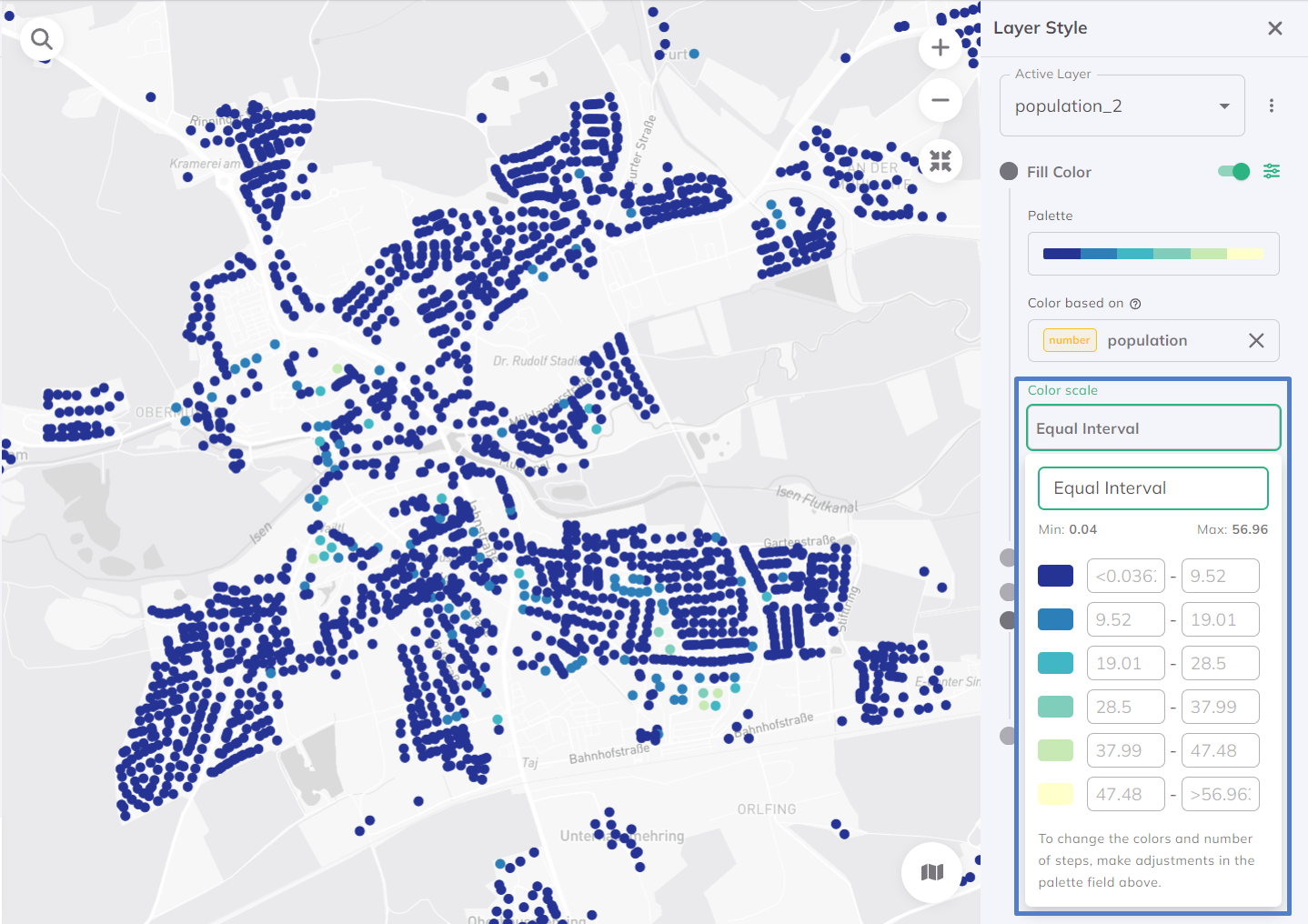
Heads and Tails
The Heads and Tails method is used to deal with datasets with a skewed distribution. It's designed to highlight extremes in the data, focusing on the 'heads' (the very high values) and the 'tails' (the very low values). This method is particularly useful for datasets where the most important information is found in the extremes, and where highlighting these values can lead to greater insight and understanding. Per default, the data is distributed into 7 classes.
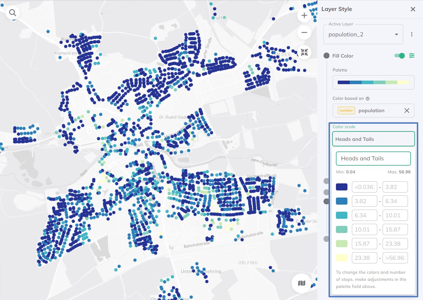
Custom Breaks (for numbers)
The Custom Break classification is a data visualization method used for numerical data. It allows users to define custom breakpoints or thresholds and therewith provides a tailored approach for context-specific visualizations.
Custom Ordinal (for strings)
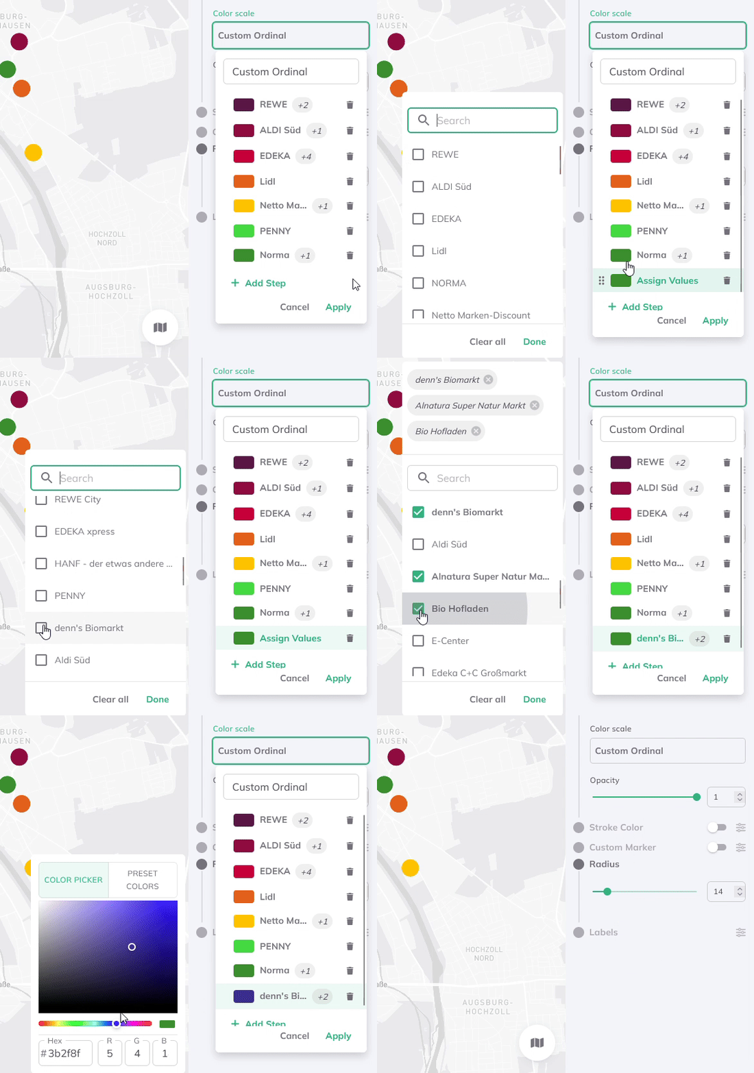
The Custom Ordinal classification is a data sorting and visualisation method applied to string data, such as categories, labels, or text-based variables. Unlike numerical data, where order is typically based on magnitude, string data often lacks a natural order. The Custom Order method therefore allows users to define their own ordering rules for strings, creating a customised sequence tailored to their specific needs.
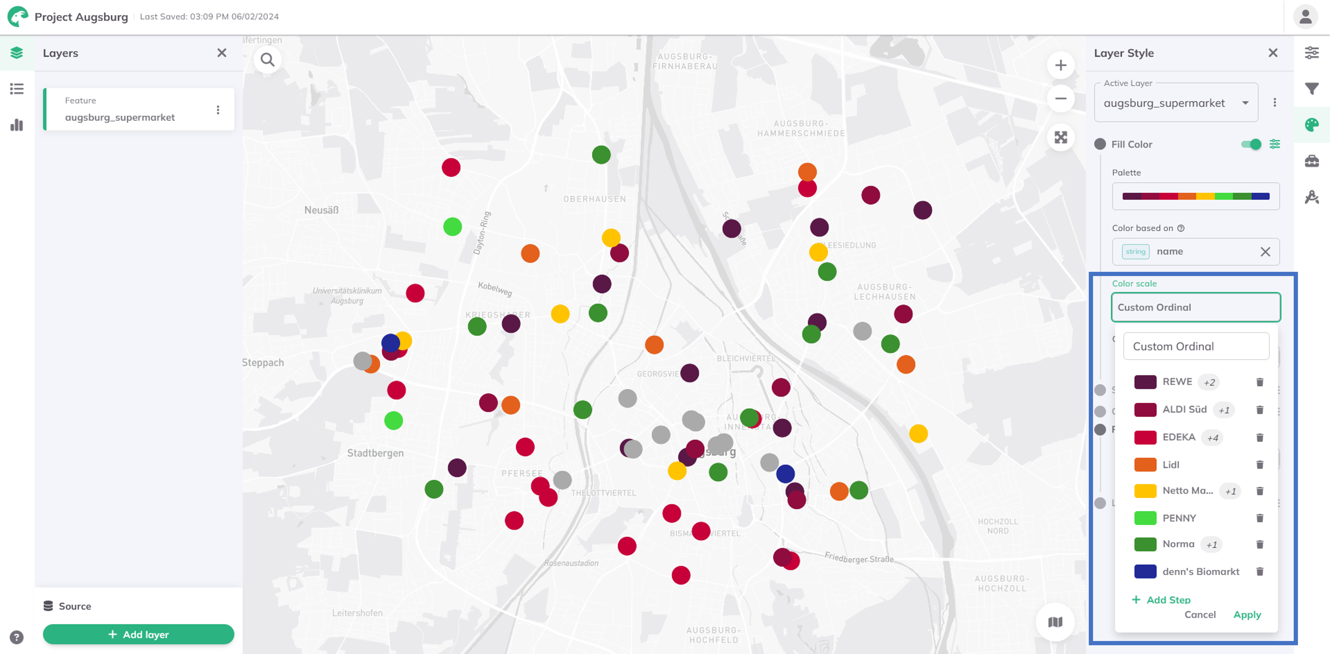
Therefore, additional steps can be added and multiple string values selected per group from a drop-down menu. The drop-down menu thereby lists all attribute values of the dataset.
Style Settings
- Fill Color
- Stroke Color
- Custom Marker
Layer. GOAT applies a random color palette to your results.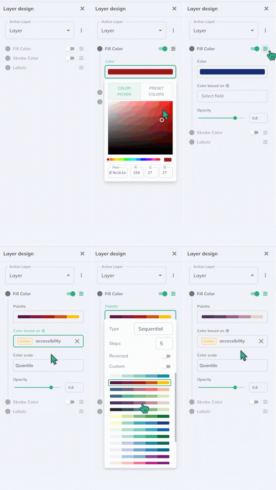
Layer. GOAT applies a random color palette to your results.