Charts
Display your data in a visual format using different types of charts: Categories, Histogram, and Pie chart.
Categories
The categories widget allows you to visualize the distribution of a categorical field from a selected layer by computing statistical analyses and generating groups by the selected field.
Categories widget on a panel and select your layer.statistic method you want to apply. It can be Count, Sum, Min, Max, or add your own Expression.field onto which the statistics should be applied. Sum, min, and max can only be applied to numeric fields.Group by field, select the field you want your results to be grouped by.Cross filter to make this widget update depending on all other connected widgets on your dashboard.Filter viewport, which makes only the data within the current map view visible.number format from the dropdown list. The default number format is dynamic based on the language of the interface. 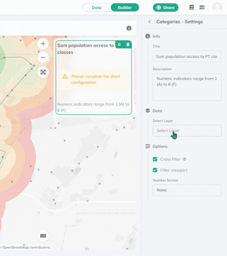
The value with the highest number will jump to the top of the chart.
Histogram
The histogram widget allows you to visualize the distribution of a numeric field from a selected layer by count.
Histogram widget on a panel and select your layer.numeric field which you want to visualize. The statistical method applied will be count. Cross filter to make this widget update depending on all other connected widgets on your dashboard.Filter viewport, which makes only the data within the current map view visible.number format from the dropdown list. The default number format is dynamic based on the language of the interface. 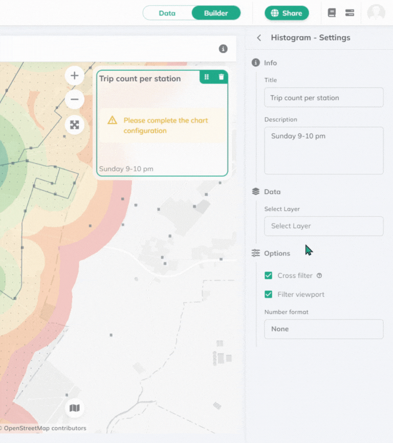
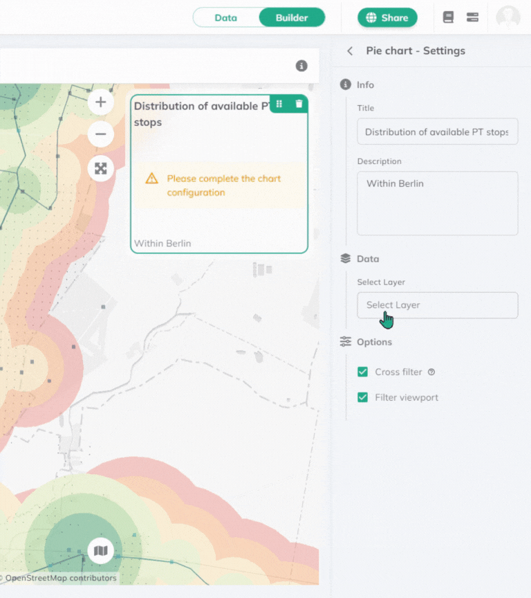
Pie chart
Pie chart widget allows you to visualize the distribution of a field from a selected layer.
Pie chart widget on a panel and select your layer. statistic method you want to apply. It can be Count, Sum, Min, Max, or add your own Expression.field onto which the statistics should be applied. Sum, min, and max can only be applied to numeric fields.field you want your results to be grouped by.Cross filter to make this widget update depending on all other connected widgets on your dashboard.Filter viewport, which makes only the data within the current map view visible.Results will be visualized in percentage.
Where statistical methods can be applied, count, sum, min, max and expression are the available options. Check out our Expressions documentation for more information.