Charts
The Charts feature allows you to quickly visualize aggregated data, result from the tools aggregate polygon and aggregate point, without complex configuration showing the relationship between your source and target layers.
How to use charts
1
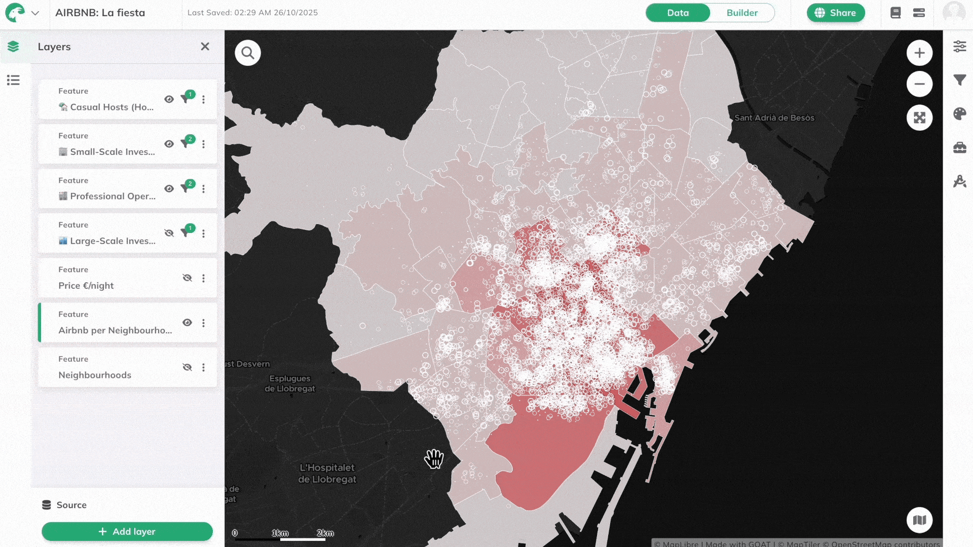
Locate your aggregated layer in the  more options menu next to the layer name.
Layers panel and click on the more options menu next to the layer name.2
Select
View Chart from the dropdown menu. A popup window will appear displaying your data visualization.3
Choose your preferred
Chart Type from the available options:- Vertical Bar Chart: Classic column chart format
- Horizontal Bar Chart: Horizontal bars for better label visibility
- Line Chart: Connected points showing data trends
4
Toggle the
Cumulative Sum option if you want to display running totals instead of individual values.5
Hover over chart elements to view precise values and additional details for each data point.
Note
Chart axes are automatically determined based on your aggregation setup and cannot be manually configured. If you don't see the chart option, ensure your layer contains aggregated data from spatial analysis tools.