Widgets
Widgets are the building blocks of the dashboard. They allow you to display various types of data and information in a visually appealing way. Each widget can be costumized to fit your needs, whether you want to show numbers, charts, or project elements like text and images.
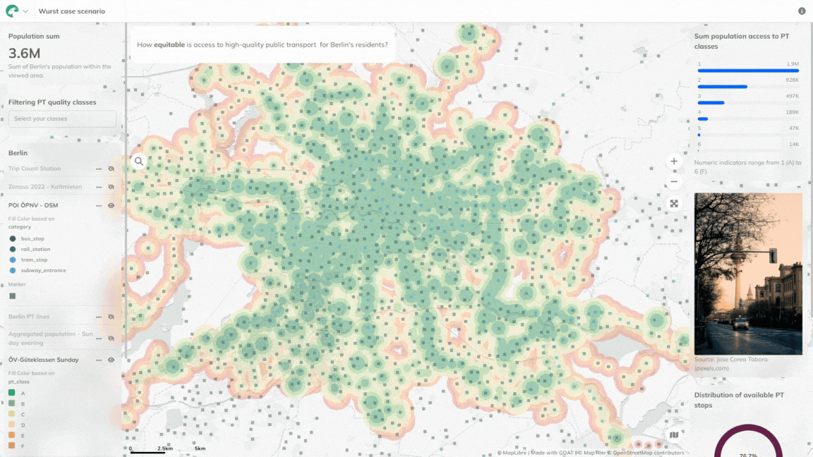
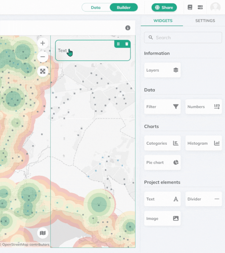
Variety of widgets available in the Builder mode
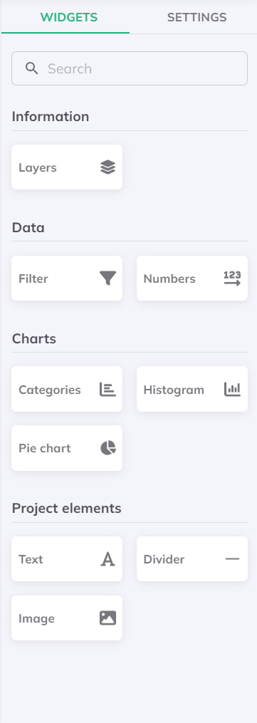
Simply drag and drop the widgets from the right sidebar to any panel on your dashboard. You can further customize each widget by clicking on it, which will open the Widget Settings.
Further options available on the selected widget:
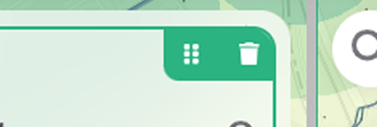
- Rearrange the widget by dragging it with the dotted icon.
- Click on the bin icon in right upper corner to delete the widget.
- You can change the Widget titel (will appear on the top of the widget) and the Description (will appear on the bottom of the widget) of all of your widgets, except for the Project elements.
- Enabling Cross filter to your Data and Chart widgets will make them interact with each other. This means that when you filter data on one widget, the other widget will update accordingly to the changes.
- The Filter viewport option can be enabled or disabled for all Charts elements and Numbers within the Data. Enabling it makes the information on the widget dynamic, meaning only the data within the current map view will be visible.
Where statistical methods can be applied, count, sum, min, max and expression are the available options. Check out our Expressions documentation for more information.
Information
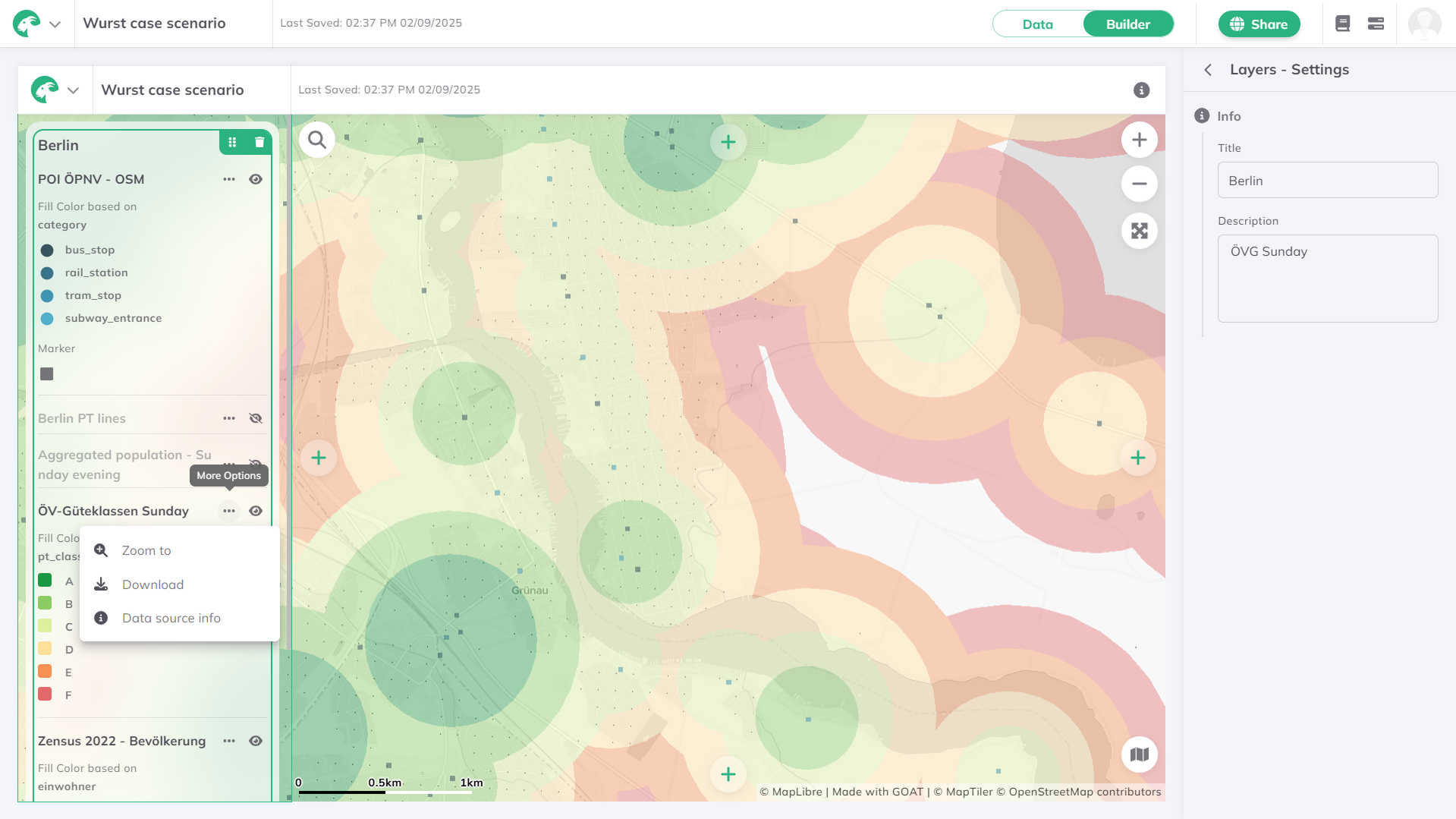
Layers
Add the legends of the layers to your dashboard.
- Zoom to layer: This will zoom the map view to the full extent of the layer. Available for the viewers as well.
- Download: Not available for the viewers.
- Data source info: Available for the viewers as well.
- Hide/Show layer: Set the default visibilty of the layers, the viewers can hide/show them.
Viewers can hide/show the pre-selected layers, but once the dashboard is reloaded, they will set back to the original visibility.
Data
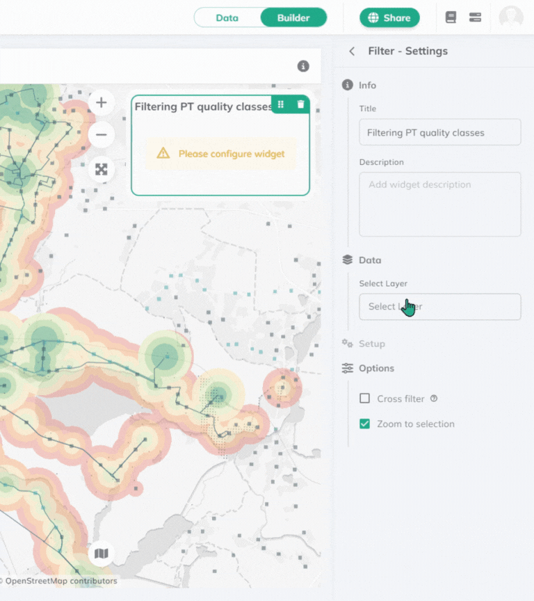
Filter
This widget is an interactive element, which allows the user to filter the data on the configured layer based on the selected attribute field. The viewers can use this as a cropping tool on the maps - this is very similar to our Filter tool in the Data mode.
- You can enable Zoom to selection, which will automatically pan the map view to the filtered data.
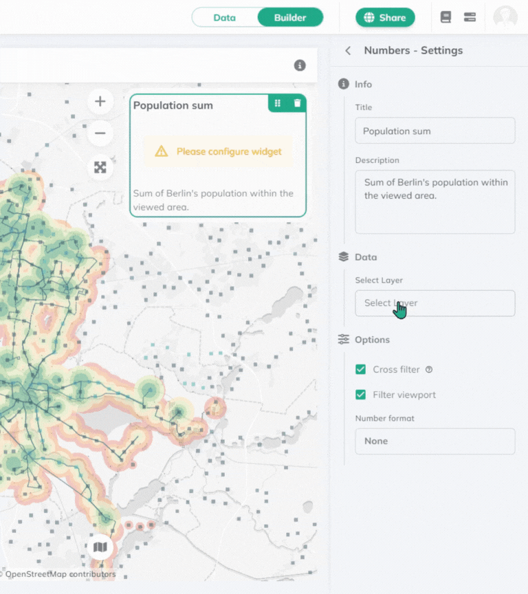
Numbers
Choose from different statistic methods to be computed on a layer.
Charts
Display your data in a visual format using different type of charts.
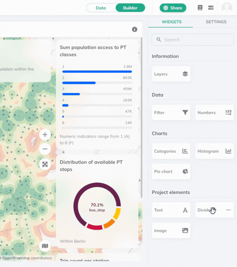
Categories
Has similar setup logic as the Numbers widget. On top of computing statistical analyses, it generates groups by the selected filed.
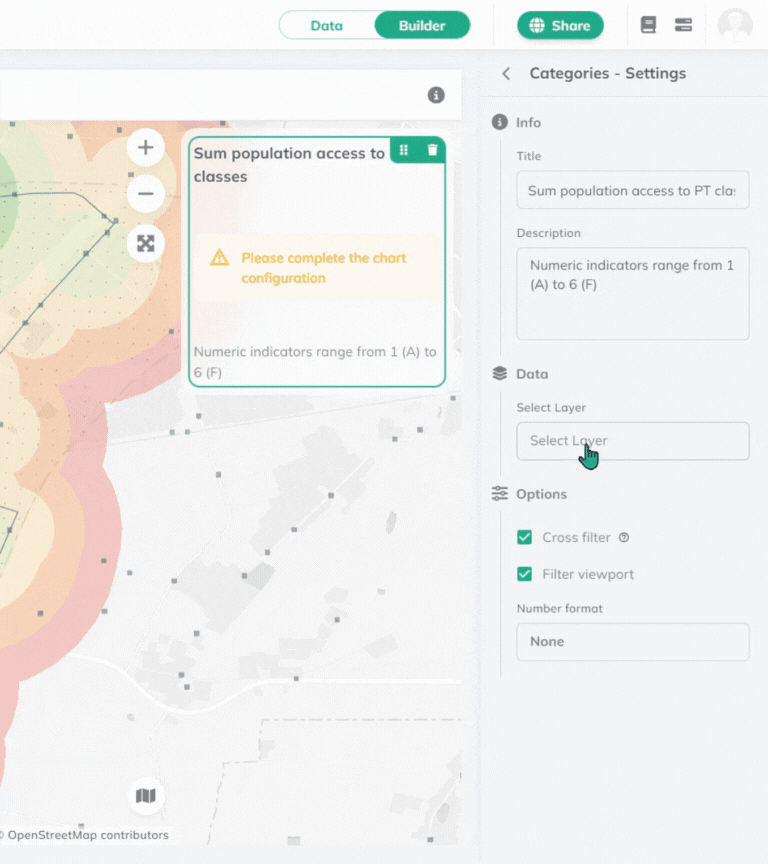
The value with the highest number will jump to the top of the chart.
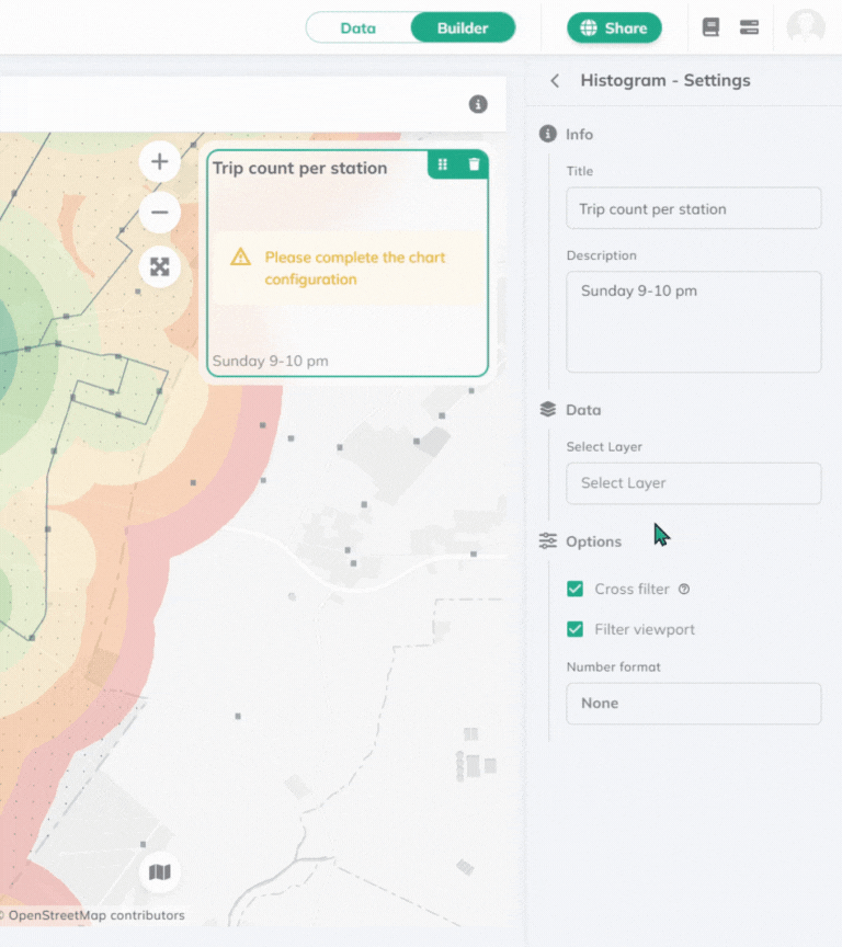
Histogram
The histogram widget allows you to visualize the distribution of a numeric field from a selected layer by count.
Pie chart
Pie chart widget allows you to visualize the distribution of a field from a selected layer.
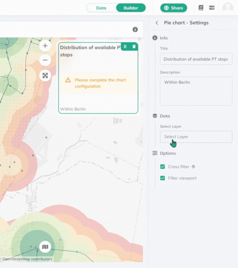
Results will be visualized in percentage.
Project Elements
This section of widgets offer extra elements to make your dashboard rounded.
Text
Add text to your dashboard. You can costumize it with the appearing buttons.
- Style your text with different headings, lists, or code blocks.
- Add bold, italic, underline, strikethrough (
Lorem ipsum), subscript (X1) or superscript (X1) to your text. - Change the alignment, add links, adjust the letter color or add highlight.
Divider
The divider widget adds a horizontal line to your dashboard, which can be used to visually separate different sections or elements within the dashboard.
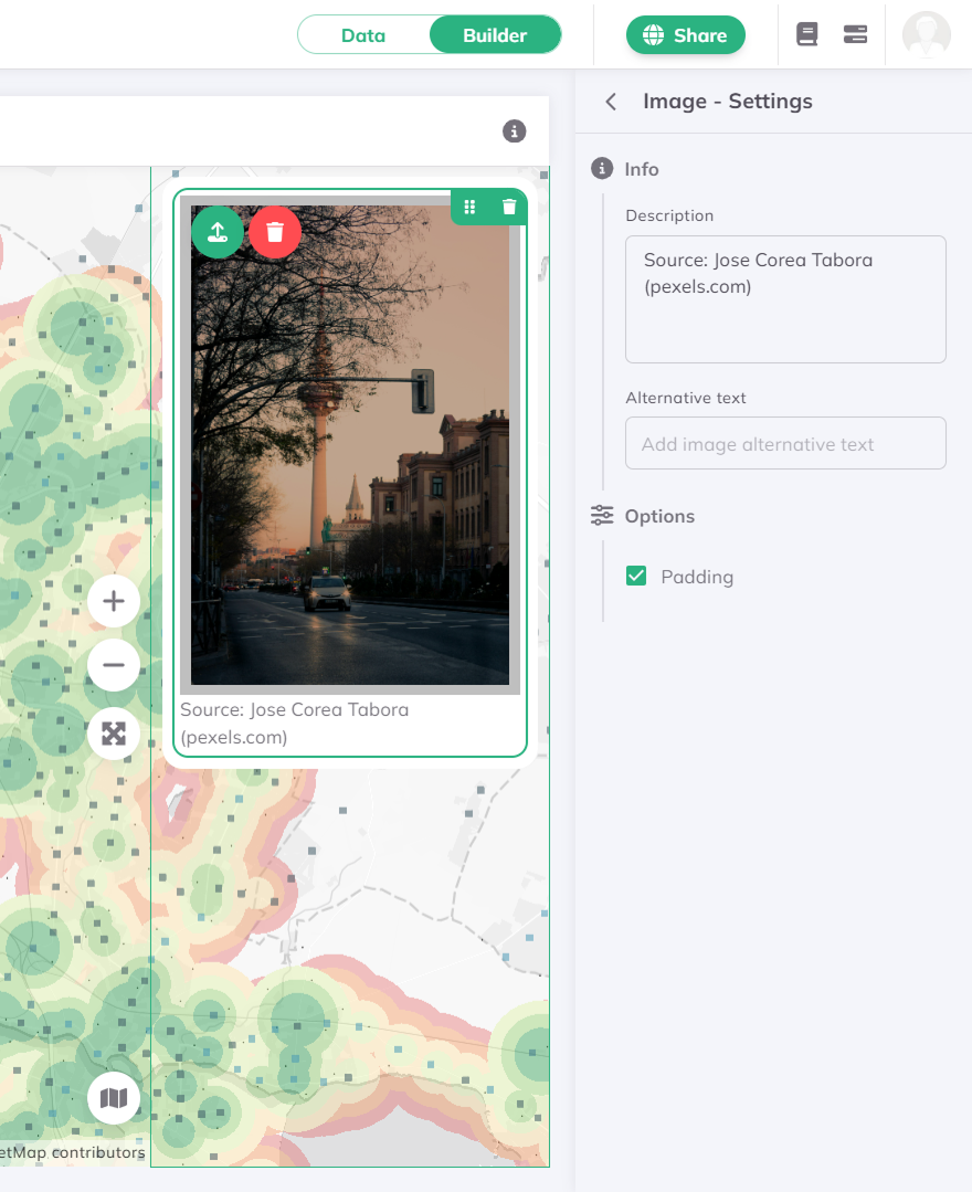
Image
Upload an image from your computer to your dashboard. When padding is enabled, it'll add a thicker border around the image.
Check out our Gallery for further dashboard inspirations.