Project Elements
This section of widgets offer extra elements to make your dashboard rounded: Text, Divider, Image, Tabs, and Links.
Text
Add text to your dashboard. You can customize it with the appearing buttons:
- You can use different headings, lists, or code blocks.
- Add bold, italic, underline, strikethrough (
Lorem ipsum), subscript (X1) or superscript (X1) to your text. - Change the alignment, add links, adjust the letter color or add highlight.
Divider
The divider widget adds a horizontal line to your dashboard, which can be used to visually separate different sections or elements within the dashboard.
Image
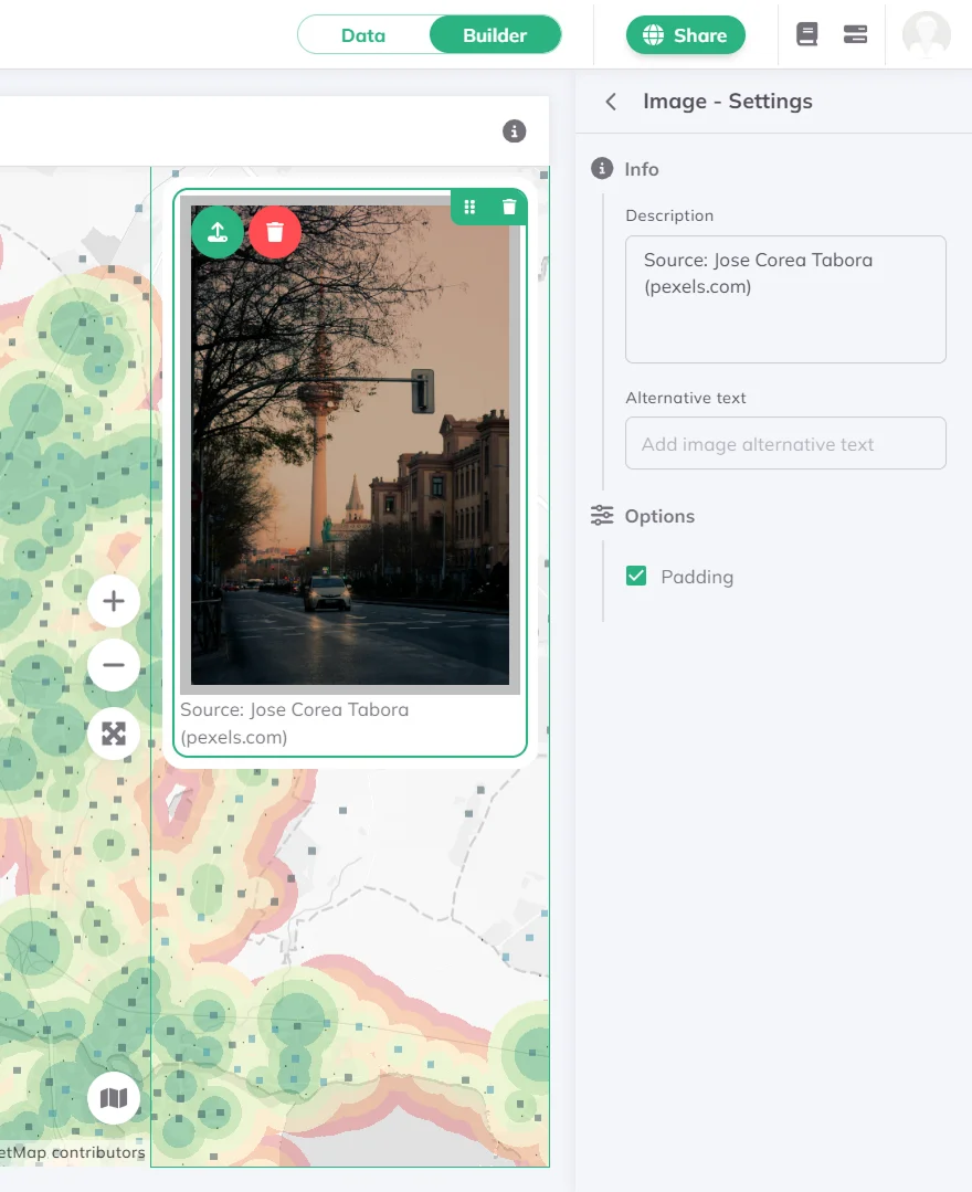
Upload an image from your computer to your dashboard. Under Info you can add a Description shown below the image and an Alternative text for accessibility. Enable Padding under Options to add inner spacing around the image.
Tabs
The Tabs widget groups other widgets in the same panel into tabbed views, letting viewers switch between them without scrolling.
Tabs widget on a panel. Add other widgets to the same panel first so they are available to assign.Info, add a Title for the widget.Under Tabs & Widgets, each tab is listed with its name and widget count. Click a tab to expand it:
- Use the
Add widget to this tab...dropdown to assign widgets from the same panel. Each widget can only be assigned to one tab at a time. - Drag the dotted icon to reorder assigned widgets. Use the ⋮ menu to remove a widget from the tab.
- Click the delete icon on a tab to remove it (available when more than one tab exists).
+ button to add a new tab.Full width to make the tab bar span the full panel width.Links
The Links widget displays a row of labelled links or popup triggers, useful for navigation, references, or inline information.
Links widget on a panel.Info, add a Title and optional Description.Under Links, each item has a URL / Popup toggle:
URL: enter aLabeland a destination URL.Popup: enter aLabeland clickConfigure popupto set thePopup type(Tooltip,Popup, orDialog),Popup placement,Size(Small,Medium, orLarge), and the popup content (Markdown supported).
Drag items to reorder them. Click the × icon to delete a link.
Add Link to add another item.Under Options:
Separator: visual divider between links (Vertical line,Dot, orDash).Secondary text: additional text shown alongside the links (e.g. a copyright notice).
Check out our Gallery for further dashboard inspirations.