Settings
In the Settings section, you can configure the map controls, branding, social sharing, and interaction behaviour of your dashboard. When you disable a functionality, it will not be available in Viewer mode.
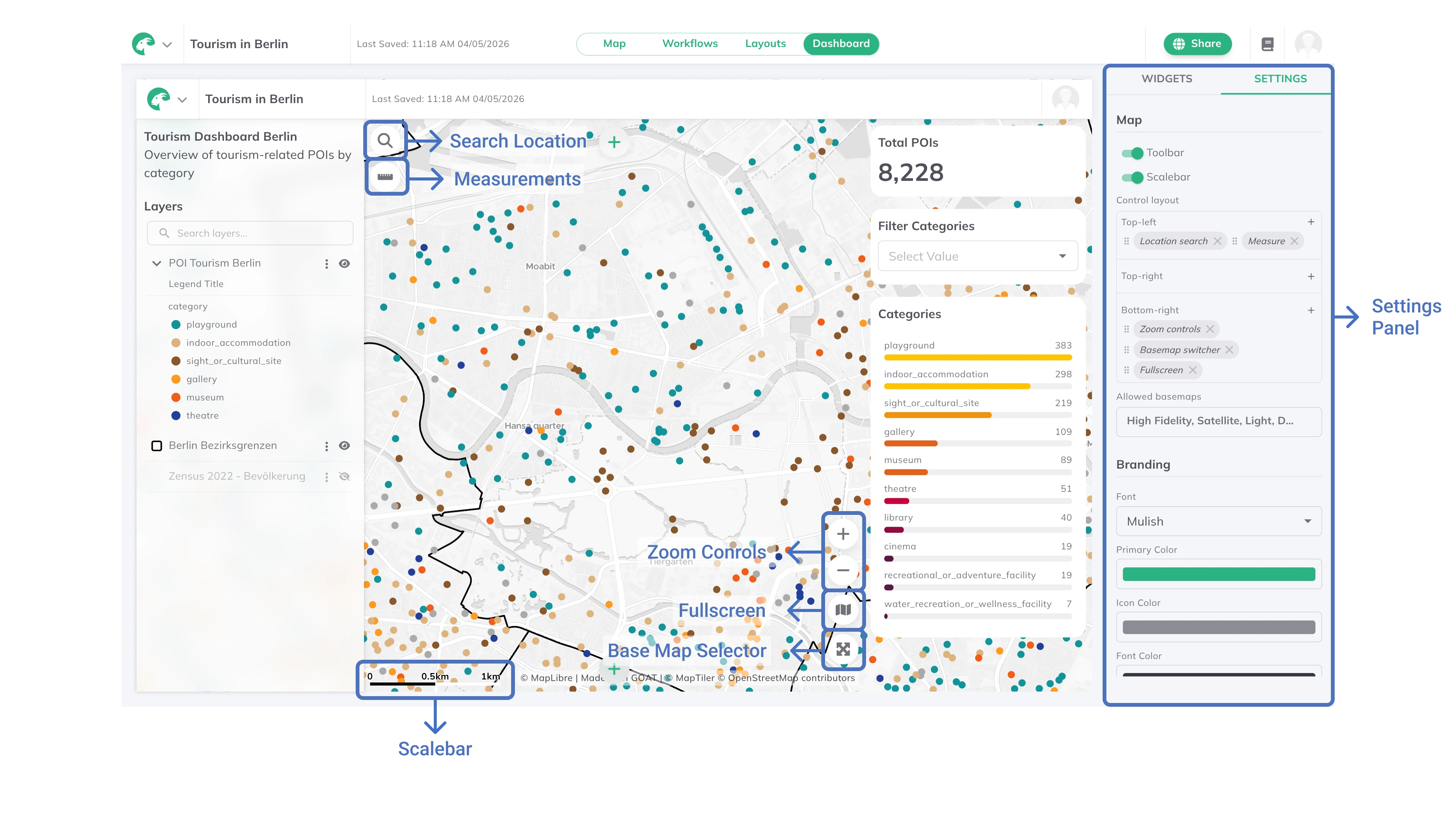
Map
Toolbar: shows the top bar with the GOAT logo, project name, last saved timestamp, and project info in Viewer mode.Scalebar: shows a scale on the map for measuring distances from one point to another.
Control layout
Controls the position of map controls in Viewer mode. Three positions are available: Top-left, Top-right, and Bottom-right. For each position, click + to add a control, drag chips to reorder them, and click × on a chip to remove it.
Available controls:
| Control | Description |
|---|---|
Location search | Search bar to jump to a location on the map |
Measure | Tool to measure distances and areas on the map |
Zoom controls | Zoom in / zoom out buttons |
Basemap switcher | Dropdown to switch the background map |
Fullscreen | Toggle fullscreen mode |
Find my location | Center the map on the viewer's current location |
Project info | Show the project info panel |
Allowed basemaps
Restrict which basemaps viewers can switch to. Select one or more basemaps from the dropdown, and viewers will only see the ones you enable here. Only shown when Basemap switcher is placed in any position.
Zoom limits
Limit how far dashboard viewers can zoom in and out. A range slider lets you set the minimum and maximum zoom level (0–22). The current map zoom is shown as a marker on the slider for reference.
Branding
Customize the visual identity of your dashboard for Viewer mode.
Font: select a typeface from the dropdown. ChooseCustom…to enter a Font file URL and Font Family name for a custom typeface.Primary Color: set the main accent color used for buttons and highlights.Icon Color: set the color for icons throughout the dashboard.Font Color: set the text color used across the dashboard.Favicon: upload a custom browser tab icon. Click×to remove it.
Social sharing
Customize how your dashboard appears when shared via social media or messaging apps.
- Preview image: drag and drop or click to upload an image (recommended: 1200×630 pixels). Falls back to the default GOAT preview when unset.
- Description: add a short description (up to 300 characters) used in social previews and search results.
General
Language: set the dashboard display language. Options:Auto (Browser Default),English,Deutsch.
Interactions
Interactions link dashboard elements together, so that one action by the viewer automatically triggers a matching change in another element. For example, activating a layer group can switch the active tab in a widget, or toggling one layer's visibility can show and hide related layers.
Click Manage Interactions to open the interactions editor. Each interaction is a rule made of a trigger (When something happens) and an action (what happens in response). Click Add Interaction to create a new rule, then choose the trigger under When. Use the Enabled toggle to turn an individual interaction on or off without deleting it.
GOAT supports two types of interaction:
Layer group activated → Switch tab
When a viewer activates a layer group, a Tabs widget switches to a tab you choose.
When to Layer group activated.Target widget: the Tabs widget whose active tab should change.Layer group and Tab, map each layer group to the tab it should open. Click Add mapping to add more pairs.Layer visibility changed → Sync visibility
When a viewer shows or hides a layer, one or more other layers are shown or hidden to match.
When to Layer visibility changed.Source layer: the layer whose visibility is watched.Target layers that should mirror the source layer's visibility. Click Add target layer to add more.Use Reset at the bottom of the panel to restore all settings to their defaults.