Interpret Results
Understanding what your heatmap shows is crucial for making informed planning decisions. Let's explore how to interpret the results.
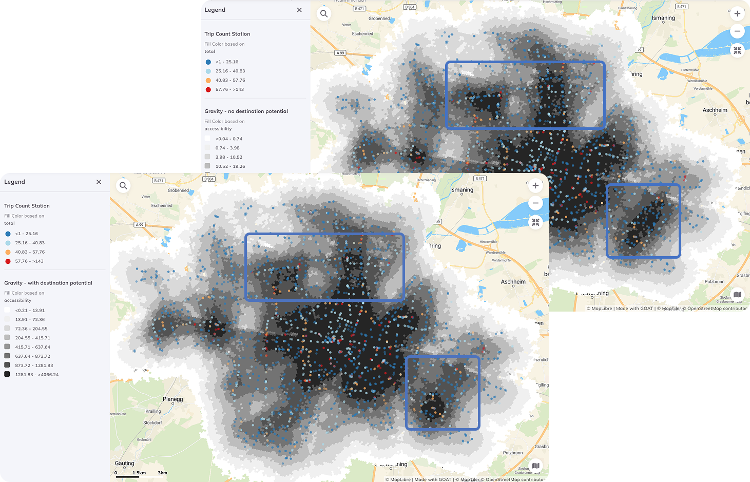
Reading the Heatmap
Color Scale
By default, GOAT uses a color scale where:
| Color | Meaning | Planning Implication |
|---|---|---|
| 🔴 Red/Orange | High accessibility | Well-served areas |
| 🟡 Yellow | Medium accessibility | Adequate service |
| 🟢 Green/Blue | Low accessibility | Underserved, needs attention |
Colors can be customized. Always check the legend to understand the scale!
What the Values Mean
The accessibility score represents the "potential" to reach opportunities, weighted by travel time. Higher scores = better access.
Example interpretation:
- Score of 1,500 → Excellent access to many nearby opportunities
- Score of 500 → Moderate access
- Score of 100 → Limited access, potential accessibility desert
Identifying Patterns
Look for These Features
1. Hot Spots (High Accessibility)
- Usually around city centers, transit hubs
- Cluster of services creates synergy
- Good areas for car-free living
2. Cold Spots (Low Accessibility)
- Peripheral neighborhoods
- Areas with poor transit connections
- Potential equity concerns
3. Gradients
- How quickly does accessibility decline from centers?
- Sharp drops indicate barriers (rivers, highways, rail lines)
Comparing different gravity-based calculations reveals patterns
Analytical Questions to Ask
Use your heatmap to answer:
Where are accessibility deserts?
- Filter for cells with scores below the median
- These areas need infrastructure investment
Is accessibility equitable?
- Overlay with demographic data
- Compare scores across income levels or age groups
What's the impact of transit?
- Compare walking-only vs. transit heatmaps
- Shows value of public transportation
Where should new facilities go?
- Look for high-population, low-accessibility areas
- These are priority locations for new services
Quantitative Analysis
Statistics to Calculate
| Metric | How to Calculate | Meaning |
|---|---|---|
| Mean | Average of all cells | Overall accessibility level |
| Std Dev | Spread of values | How unequal is access? |
| Gini Coefficient | (Advanced) | Accessibility inequality |
| Coverage | % cells above threshold | Service area coverage |
Using the Data Table
Click on the heatmap layer and open the Data Table to:
- Sort cells by accessibility score
- Filter for specific ranges
- Export data for statistical analysis
Next Step
Now let's make your heatmap look professional with advanced styling techniques!
Progress: 3 of 4 steps completed