Advanced Styling
Transform your heatmap into a publication-ready visualization with advanced styling techniques.
Styling for Impact
Watch: Attribute-Based Styling
Color Classification Methods
Choose the right classification for your story:
Quantile
Divides data into equal-count groups.
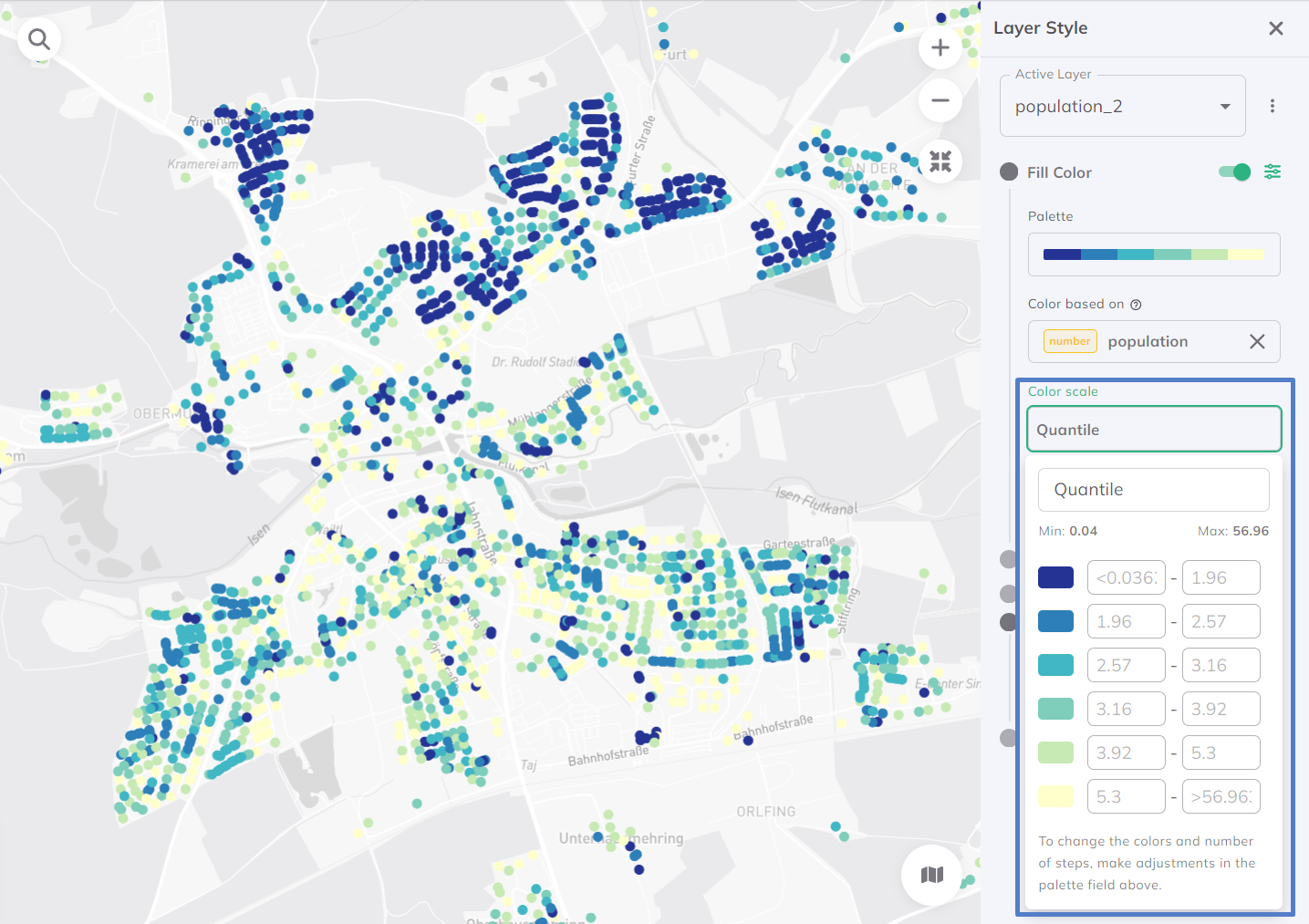
Best for: Showing relative ranking (top 20%, bottom 20%, etc.)
Equal Interval
Divides range into equal-width groups.
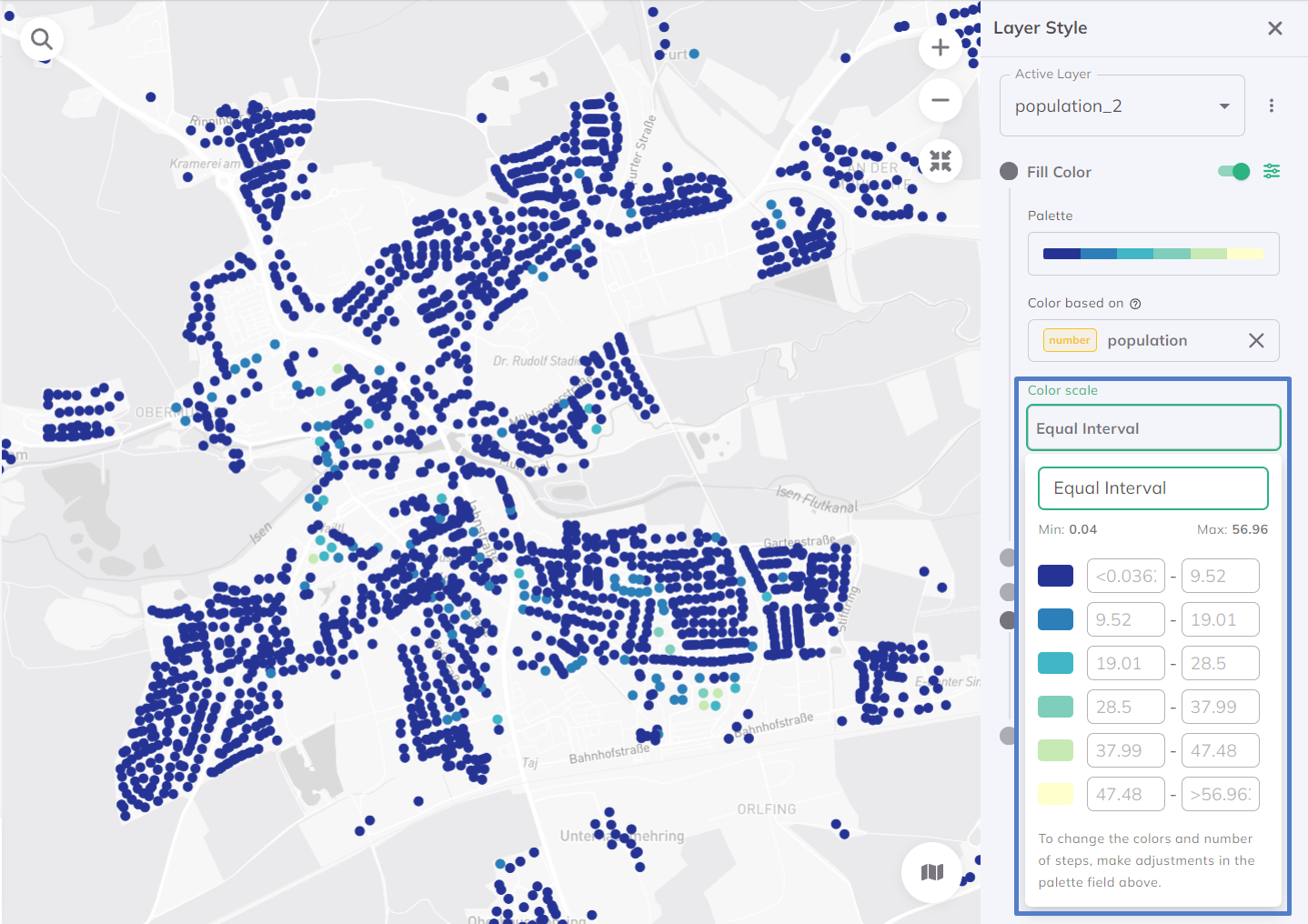
Best for: Showing actual value differences
Standard Deviation
Groups based on distance from mean.
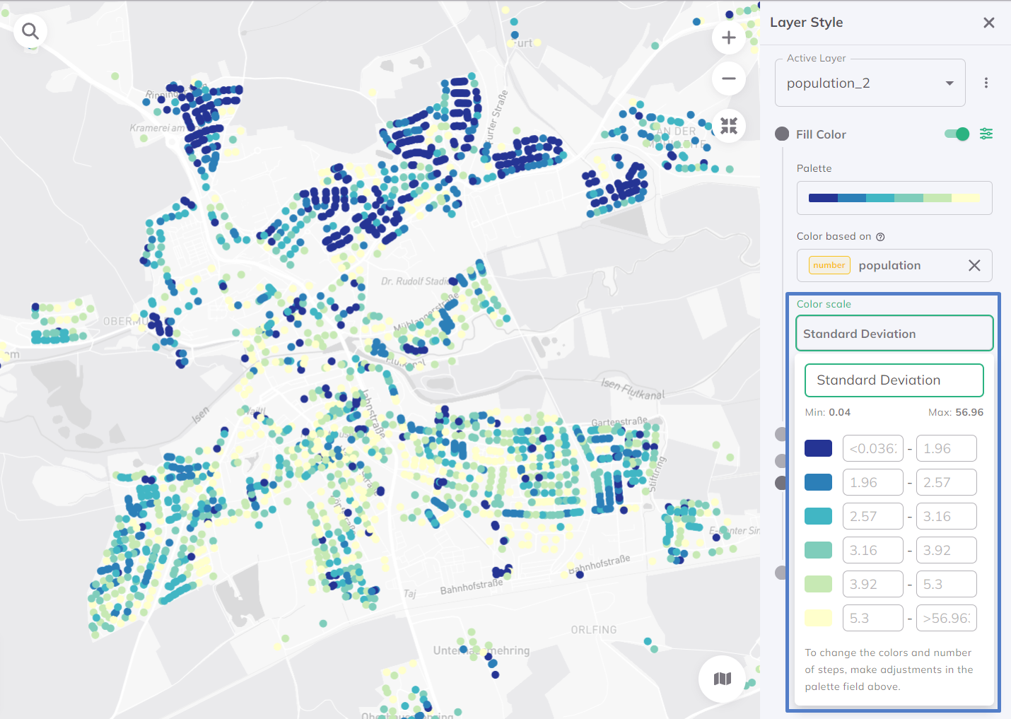
Best for: Identifying outliers and normal ranges
Recommended Color Palettes
For Accessibility Heatmaps
Sequential (Single-Hue):

- Light = Low accessibility
- Dark = High accessibility
- Clean, easy to read
Diverging (Two-Hue):

- Two contrasting colors
- Neutral middle value
- Good for above/below average
Fine-Tuning Your Style
Adjusting Transparency
Set opacity to 60-80% so the basemap context is visible.
Stroke Settings
For hexagonal grids:
- Stroke Width: 0 or 0.5px (thin borders)
- Stroke Color: Match fill or use subtle gray
- Avoid thick borders that distract from patterns
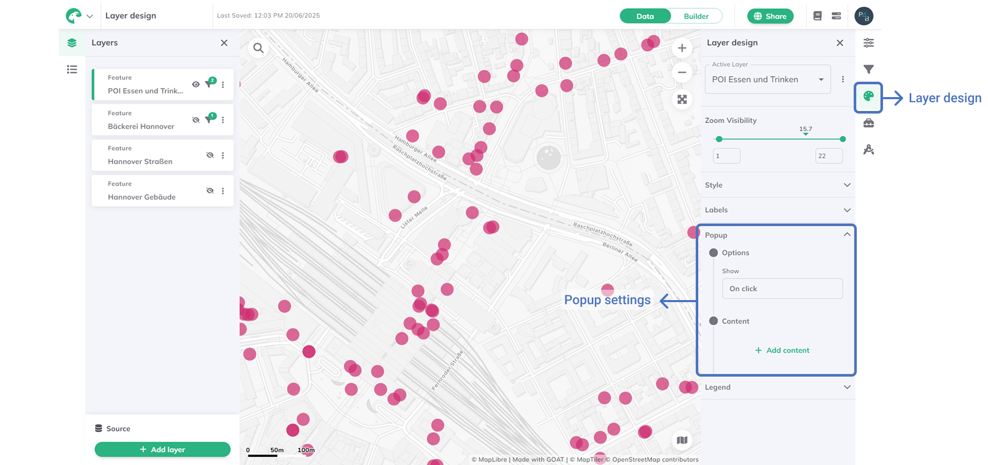
Interactive Popups
Configure popups to show:
- Accessibility score
- Travel time statistics
- Opportunity count
- Comparison to average
Publication-Ready Export Tips
- Choose a clean basemap - Grayscale or minimal style
- Add a clear legend - Include units and classification method
- Use consistent color schemes - Match organizational branding
- Include scale and north arrow - For print materials
- Test at print size - Colors may look different on paper
🎉 Tutorial Complete!
Congratulations! You've mastered heatmap accessibility analysis in GOAT.
What You Learned
- ✅ How gravity models calculate accessibility
- ✅ Configuring heatmap analysis parameters
- ✅ Interpreting spatial accessibility patterns
- ✅ Creating professional visualizations
Continue Learning
- Tutorial 3: Scenario Planning - Model future scenarios and compare alternatives
🏆 You're now a heatmap pro!