Configure the Heatmap
Let's configure and run a gravity-based heatmap analysis to see accessibility patterns across your study area.
Watch the Walkthrough
Step-by-Step Instructions
1. Open the Toolbox
Click on Toolbox → Accessibility Indicators → Heatmap Gravity
2. Select Opportunities Layer
Choose the layer containing your destinations (opportunities). This could be:
- Schools, hospitals, shops
- Jobs, services, amenities
- Any POI dataset
3. Configure Travel Settings
Transport Mode
Select how people travel to these opportunities:
| Mode | Typical Use Case |
|---|---|
| 🚶 Walking | Neighborhood services (shops, schools) |
| 🚴 Cycling | District-level amenities |
| 🚌 Public Transit | City-wide services (jobs, hospitals) |
Maximum Travel Time
Set the cutoff time. Destinations beyond this are considered "unreachable":
- 10 min - Immediate neighborhood
- 20 min - Extended walking/short cycling
- 30 min - Transit commute
- 45 min - Typical commute threshold
4. Choose Impedance Function
Select how travel time affects attractiveness:
Recommended: Start with Gaussian function with default sensitivity.
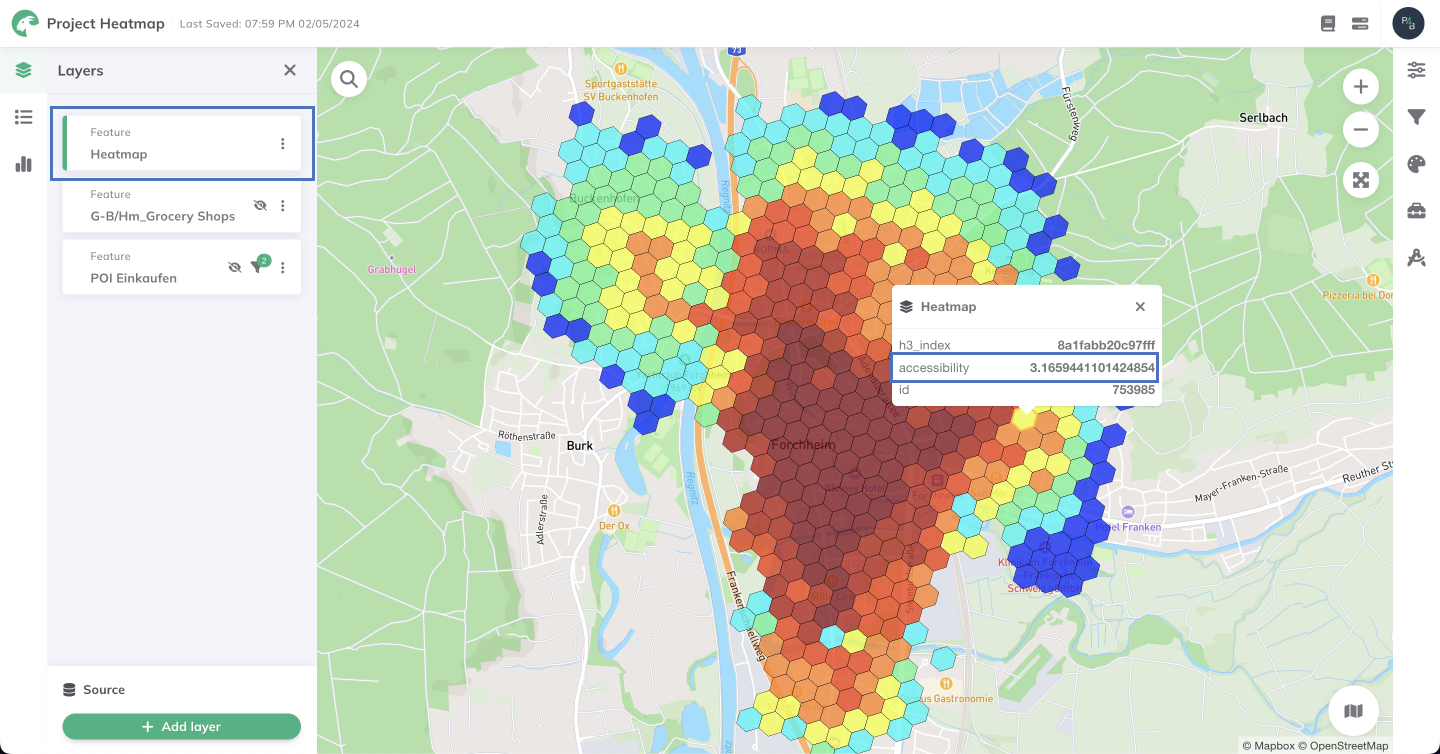
Example gravity-based heatmap showing accessibility patterns
5. Set Sensitivity Parameter
The sensitivity controls how quickly accessibility decays with distance:
| Sensitivity | Effect |
|---|---|
| Low (300-400) | Gradual decay, distant destinations still matter |
| Medium (200-300) | Balanced decay |
| High (100-200) | Sharp decay, only close destinations matter |
6. Choose Output Resolution
Select the grid cell size for results:
- H3 Resolution 8 - ~460m cells (city overview)
- H3 Resolution 9 - ~174m cells (neighborhood detail)
- H3 Resolution 10 - ~65m cells (high detail, slower)
7. Run the Analysis
Click Run and wait for GOAT to calculate accessibility scores for every cell in your study area.
Higher resolutions create more detailed maps but take longer to compute. Start with Resolution 9 for a good balance.
Understanding the Output
Your heatmap shows:
- High values (warm colors) = Good accessibility
- Low values (cool colors) = Poor accessibility
- Grid cells = Consistent spatial units for comparison
Next Step
Your heatmap is ready! Let's learn how to interpret the results.
Progress: 2 of 4 steps completed